Excel Dashboard Design: Pivot Tables, Pivot Charts, and Slicers Explained
Автор: Data Afric
Загружено: 2026-01-15
Просмотров: 4
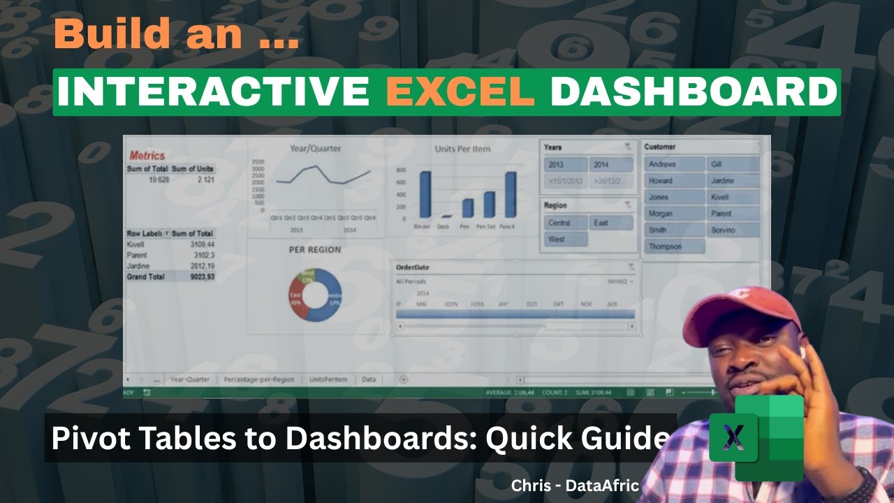
Unlock the power of Excel dashboard design with practical, hands-on guidance. In this video, we walk through every Pivot Chart type, showing you not only what they are, but when and how to use each one effectively. Starting from Pivot Tables, we design a professional, easy-to-understand dashboard and explain every step in detail.
What you’ll learn:
A comprehensive overview of all Pivot Chart types and their ideal use cases
How to convert Pivot Tables into a polished, professional dashboard
Step-by-step setup: data layout, charts, and dynamic visuals
How to keep dashboards simple and actionable while conveying insights
Adding slicers and a timeline for interactive data exploration
Practical tips for beginners and students to build real-world dashboards
Why watch this:
Clear, practical demonstrations suitable for beginners and students
Real-world dashboard design techniques you can apply to your own datasets
Focus on clarity, usability, and speed—perfect for data analytics training
Who is this for:
Beginners to intermediate Excel users
Students and professionals wanting a solid, practical dashboard workflow
Anyone who wants to design clean, impactful data visuals in Excel
Tools and topics covered:
Pivot Tables, Pivot Charts
Dashboards design principles
Slicers and Timeline filters for interactivity
Data visualization best practices
Follow along and create your own beginner-friendly, professional Excel dashboard in minutes. If you found this helpful, please like, subscribe, and leave a comment with what you’d like to see next!
Timestamps:
0:00 Introduction
2:15 Pivot Chart types overview
6:40 Pivot Table to dashboard workflow
12:20 Designing the dashboard layout
15:45 Adding slicers and timeline
19:10 Final tips and best practices
21:00 Quick recap
#Exceldashboarddesign
#PivotCharttypes
#Exceldashboardtutorial
Доступные форматы для скачивания:
Скачать видео mp4
-
Информация по загрузке:


