How to Develop Excel Agile Project Management Dashboard with Sprint Circle and Burndown Chart
Автор: Excel Visual
Загружено: 2026-01-01
Просмотров: 902
Agile project management requires clarity, focus, and fast feedback.
Dashboard Template: https://exceltable.com/en/templates/s...
In this video, we develop an Excel Agile Project Management Dashboard designed for tracking sprint progress, workload balance, and overall project dynamics using interactive visual controls.
Video Chapters ⏱️ ▶️
0:00 Introduction
2:03 Building the dashboard grid and design template in Excel
10:07 Analyzing source data for agile project management
10:48 Creating pivot tables and slicers for interactive dashboard control
12:57 Creating a bar chart with cursor to analyze sprint circle story points
20:45 Project progress tracking chart
24:40 Radar chart for analyzing related agile metrics
34:23 How to build a flexible burndown chart in Excel
44:13 How to create a dynamic sprint circle with adjustable history points
59:20 Light theme version of the agile project management dashboard
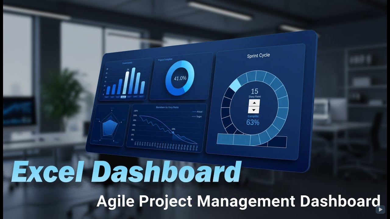
This dashboard demonstrates how standard Excel tools and formulas can be used to build a professional agile report without external BI systems. The focus is on visual simplicity, logical structure, and meaningful metrics that help a project manager quickly understand the current state of the sprint and the direction of the project.
The dashboard includes fully interactive visualization blocks:
➡️ Story Point Bar Chart – visualizes sprint workload and distribution of effort across tasks. Helps evaluate team capacity and sprint balance.
➡️ Sprint Cycle Chart (Sprint Circle) – shows sprint progression in a circular format, making iteration cycles intuitive and easy to track.
➡️ Burndown Chart – tracks remaining work versus time and highlights deviations from the planned sprint trajectory.
➡️ Radar Chart – compares multiple agile metrics at once to identify strengths, bottlenecks, and imbalance in sprint execution.
All charts are connected through control elements and react dynamically to selected sprint periods. This allows flexible analysis of different iterations without rebuilding the dashboard or changing data manually.
The goal of this dashboard is not to overload the user with numbers, but to provide a clear visual model of agile execution. One glance should be enough to understand progress, risks, and focus points for the next sprint decisions.
This approach works especially well for:
✔ Agile and Scrum teams
✔ Project managers
✔ Product owners
✔ Excel-based reporting environments
By using Excel as a visualization platform, you gain transparency, speed, and full control over your agile metrics—without sacrificing design or usability.
This video shows how to develop an Agile project management dashboard in Excel step by step. You will see how to design a clean dashboard layout, prepare agile data, and build interactive charts for sprint tracking and progress analysis. The tutorial covers pivot tables, slicers, sprint circle visualization, story point analysis, burndown chart creation, and radar metrics. The final result is a flexible and clear Excel dashboard that helps monitor sprint cycles, project progress, and key agile indicators in a single view.
#ExcelAgileDashboard
Доступные форматы для скачивания:
Скачать видео mp4
-
Информация по загрузке: