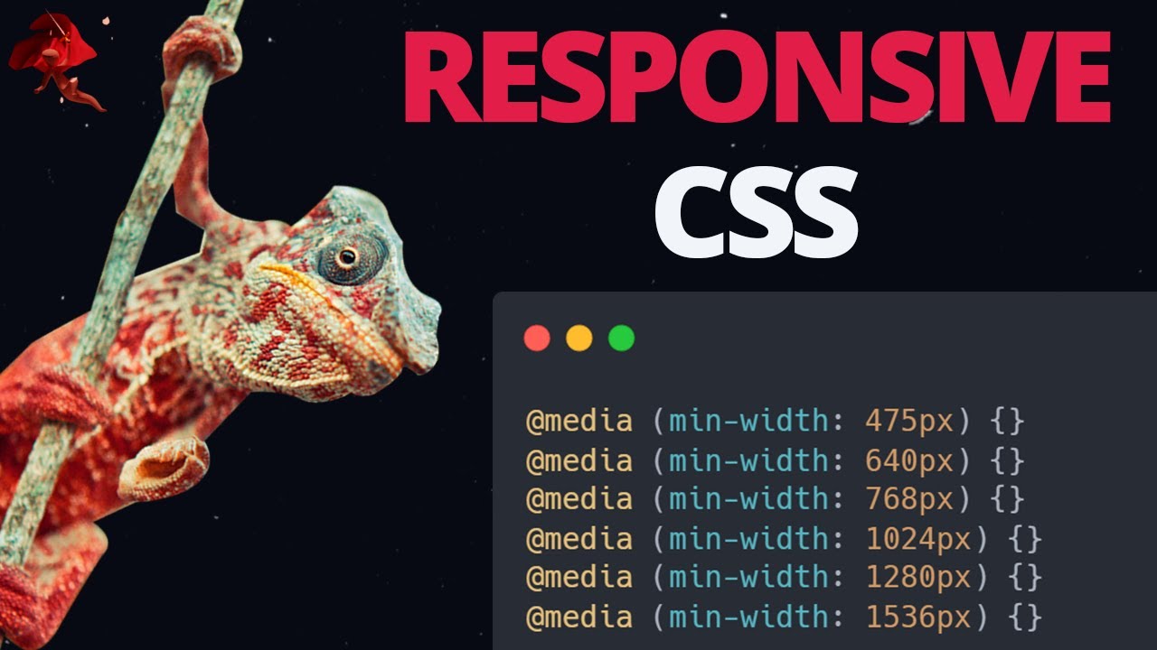
Responsive Web Design with CSS Media Queries complete tutorial
Автор: EGATOR
Загружено: 2025-08-09
Просмотров: 885
HTML & CSS Full Course Discount: https://www.udemy.com/course/html-css...
Hostinger Discount: https://www.hostg.xyz/SH8cs
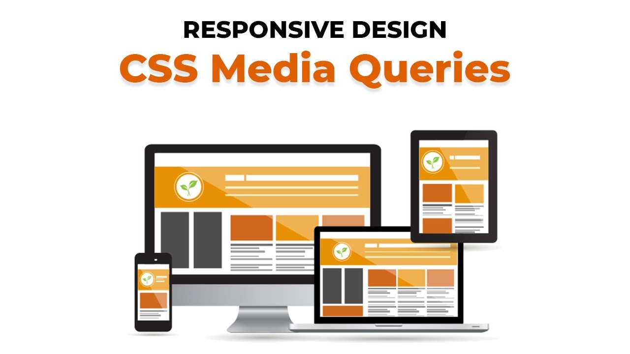
This is a full in-depth tutorial on how to create responsive websites and web applications using CSS media queries. You will learn how responsive design sets your websites apart to make it look good on all device widths, including mobile phones, tablets, and desktop devices. I will teach you the different types of media, the features you can target when creating responsive designs, how the viewport meta tag helps with building responsive designs, different ways of adding responsive media queries to your project, and more! This video tutorial teaches you everything you need to know in order to start building responsive websites and web apps today using CSS Media Queries.
Timestamps:
00:00 What is responsive design and what does it do?
03:53 Media Types (Media Query rule)
08:27 Media Query Features
16:20 Responsive Design project with CSS Media Queries
41:34 View Port Meta Tag
45:27 How to preview your website on different devices
49:09 Separating your media query files
Доступные форматы для скачивания:
Скачать видео mp4
-
Информация по загрузке:


![Курс по Верстке сайтов с Нуля для Начинающих [aroken.ru]](https://imager.clipsaver.ru/eMhhl1Wq8JA/max.jpg)