Add Dynamic Data Labels above the Bar in Power BI | Tell a Story with Emojis + DAX | MiTutorials
Автор: MITutorials
Загружено: 2025-04-23
Просмотров: 1766
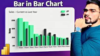
Want to make your Power BI bar charts stand out? In this tutorial, I’ll show you how to display dynamic, meaningful data labels directly above your bars—powered by DAX and enhanced with emojis to communicate trends instantly!
You’ll learn how to: ✅ Highlight YoY performance with context
✅ Show custom messages like “🚀 Excellent Growth” or “🔻 Decline”
✅ Use DAX to conditionally format your labels
✅ Add personality and storytelling to your visuals
💡 Perfect for dashboards that need to do more than just show numbers—they tell a story your audience will actually remember.
📌 Try this in your next report and take your Power BI game to the next level!
🔔 Subscribe for weekly Power BI tips and tutorials
💬 Drop your custom label ideas in the comments!
#PowerBI #DataVisualization #DAX #PowerBITips #StorytellingWithData
Download Dataset : https://shorturl.at/2oMmh
For Queries ✉ : [email protected]

Доступные форматы для скачивания:
Скачать видео mp4
-
Информация по загрузке: