How Flexbox & Grid Container work in Elementor? Columns & Rows Explained
Автор: LearnWeb Academy
Загружено: 2025-12-08
Просмотров: 45
In this tutorial, you will learn exactly how Flexbox and Grid Containers work in Elementor, and how to use them to build modern, responsive layouts with ease.
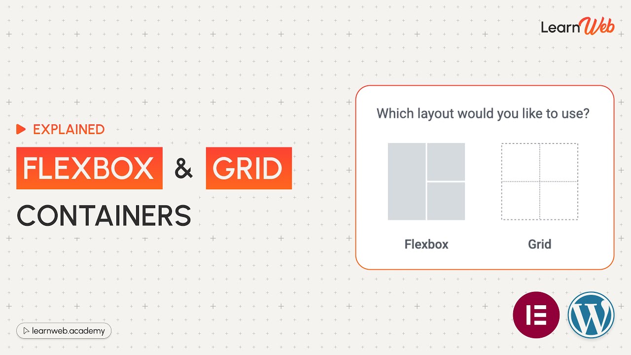
Elementor’s new Container-based design system (Flexbox & Grid) replaces old sections/columns and gives you FAR more control. If you want to design clean, professional, mobile-responsive websites — this video is an absolute must-watch.
Get Premium Themes & Plugins (Licensed only, Not GPL/Nulled)
🔗 Check the full list here: https://learnweb.academy/activations-...
⭐ What You Will Learn in This Video:
✔ What Flexbox is and how it works in Elementor
✔ What Grid is and when to use it
✔ How to structure layouts using Flex containers
✔ How to create multi-column layouts without using old columns
✔ How to align, justify, wrap, reorder, and space elements
✔ How to build 2D layouts using Grid containers
✔ How to make your layout responsive for mobile & tablet
✔ Real examples of building sections with Flex & Grid
Perfect for beginners, designers, freelancers, and anyone upgrading to Elementor’s new container system.
🔍 Find us here:
Instagram: / learnweb.academy
Linkedin: / learnwebacademy
Twitter: https://x.com/LearnWebAcademy
Pinterest: / learnwebacademy
Our Website: https://learnweb.academy
👍 Like the video if you found it helpful
💬 Drop your questions in the comments
🔔 Subscribe to LearnWeb Academy for more WordPress tips and tutorials
#LearnWebAcademy
Доступные форматы для скачивания:
Скачать видео mp4
-
Информация по загрузке:


![Камеди клаб [НОВЫЙ 2026] [full HD] Сборник избранных смешных и юмористических эпизодов | часть 5](https://image.4k-video.ru/id-video/hFezUJlKMmM)


