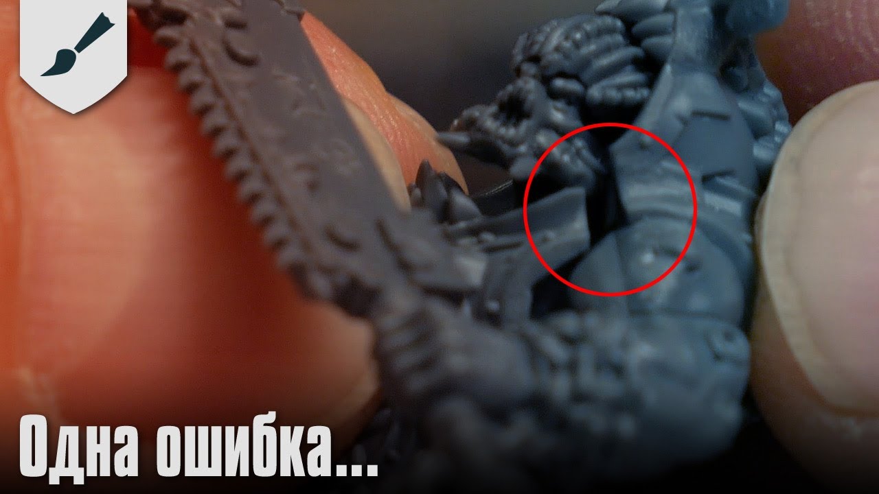
GW's New Logo Is Perfect For Modern Warhammer And 40k
Автор: The ArchCast
Загружено: 2025-07-28
Просмотров: 38248
It's studiously soulless, created by people who have never cared for Warhammer or 40k beyond their next paycheck. It's the perfect representation of a company now locked in an inevitable spiral towards self annihilating irrelevance. The well deserved fate of a setting that hates it's fans, and wishes to replace them with consumers and amazon marketing executives. This new logo is not a symptom of the disease, it's the end of GW's life cycle.
/ @thearchcast
Watch us on Kick!
https://kick.com/thearchcast
For On Screen Streamlabs Superchats
https://www.streamlabs.com/TheArchCast
The much requested PayPal donation link!
https://www.paypal.com/donate/?hosted...
Rumble Archive
https://rumble.com/c/TheArchCast
Twitter for thearchcast!
/ tarchcast
Consider supporting me on SubscribeStar or Patreon!
https://www.subscribestar.com/arch-wa...
https://www.patreon.com/user?u=3863342
#warhammer #warhammer40k #gamesworkshop
And of course subscribe to the channel for more entertainment and trending news commentary and reactions. As we continue to cover the pop cultural divide and the culture war on the left and the right

Доступные форматы для скачивания:
Скачать видео mp4
-
Информация по загрузке: