How to Create STUNNING Bar Chart Race Animation with Gemini AI
Автор: AsapGuide
Загружено: 2025-12-10
Просмотров: 921
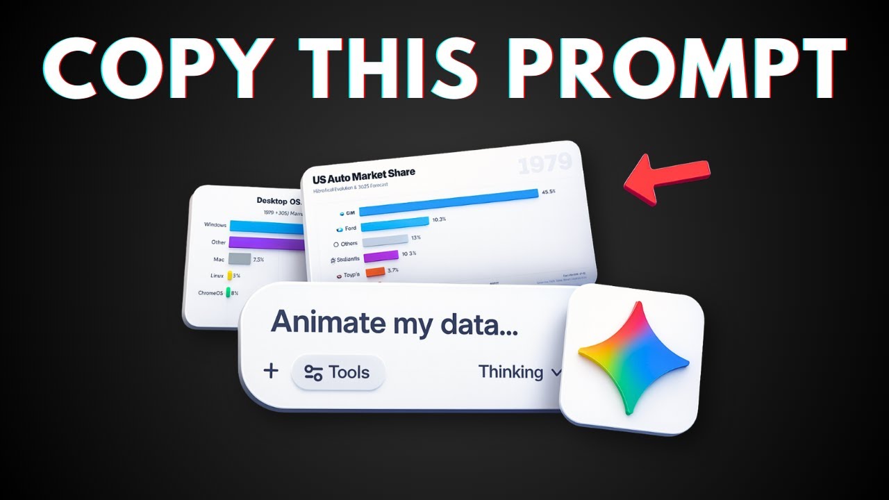
👉 In this video, I will show you how to create animated bar chart races using Gemini AI Canvas without spending a dime. This free method lets you visualize data trends over time with smooth animations that grab attention, making it ideal for presentations, social media content, or data storytelling. Just copy my simple prompt technique and watch your data come alive with racing bars that track changes across categories.
Prompt 1:
Research the top [TOPIC] market share between [YEARS] in a monthly basis. Make sure the data is detailed, accurate, and in a table format.
Prompt 2:
Based on that, create a web app that shows bar chart races in a fun, animated way. Use a rainbow-colored bar chart against white background with a scale where the bars race against each other to show how the rankings change over time. Make sure the it is responsive and the animation is smooth. Let the user control the speed of playback.
❤️ Subscribe: / @asapguide
Доступные форматы для скачивания:
Скачать видео mp4
-
Информация по загрузке:


