Create stunning Infographic visuals in Excel | How to let your data tell a story!
Автор: Greg Perkins
Загружено: 2023-07-29
Просмотров: 601
#exceltips #exceltricks #excelgraphs
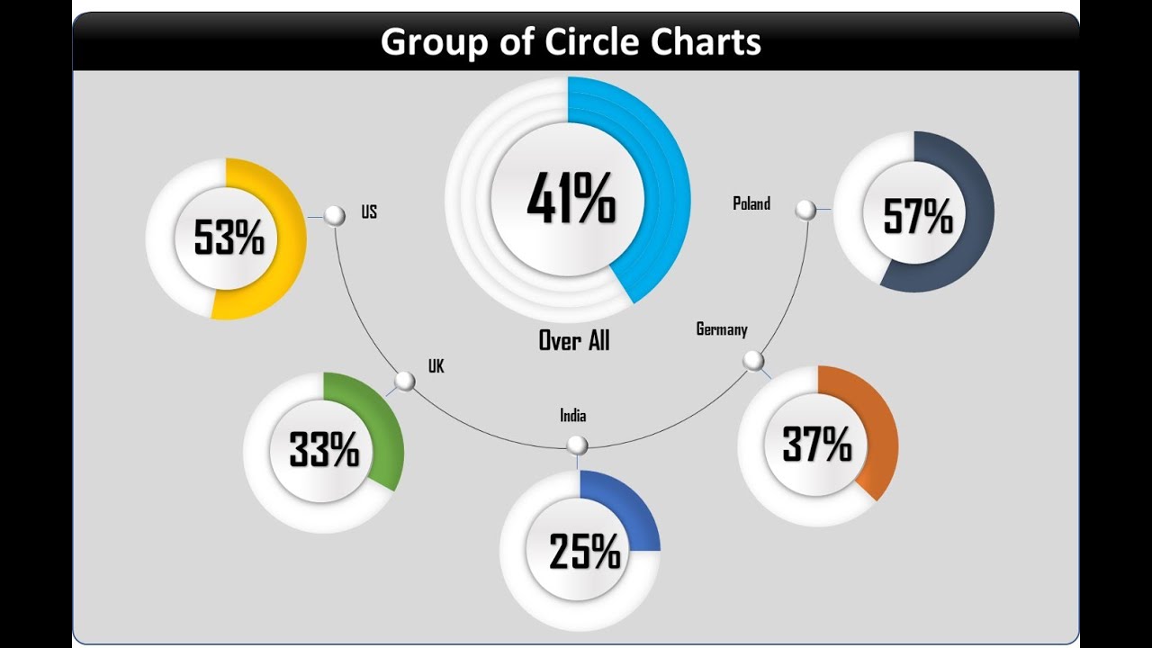
In this video, I'm going to show you how to create stunning Infographic visuals in Excel using data visualisation techniques.Infographics are a great way to communicate your data in a visually appealing way. They can be used to display data on a screen, or to create brochures, marketing materials, and more. In this video, I'll show you how to easily create stunning Infographic visuals in Excel using data visualisation techniques. After watching this video, you'll be able to create stunning Infographic visuals in Excel that will help you tell your data story in a visually appealing way!
Timestamps⌚️:
00:00 - Intro
00:18 - Add bar chart for infographic
03:20 - Add shape to infographic
05:25 - Add data labels & icon
07:07 - Add scatterplot graph to make it dynamic
11:11 - Wrap up

Доступные форматы для скачивания:
Скачать видео mp4
-
Информация по загрузке: