Популярное

Музыка Кино и Анимация Автомобили Животные Спорт Путешествия Игры Юмор

Интересные видео

2025 Сериалы Трейлеры Новости Как сделать Видеоуроки Diy своими руками

Топ запросов

смотреть а4 schoolboy runaway турецкий сериал смотреть мультфильмы эдисон
dTub
Скачать

Descriptive Statistics - Box plot and Histogram in Google Colab Python

Автор: Pakuppaivu

Загружено: 2021-10-12

Просмотров: 4554

Описание:

#BoxPlot #Histogram #Colab

Creating Box plot / whisker's plot and histogram using Google Colab #python will become simple task after watching this video. We have explained the need to use Python for chart preparation on comparison to Spreadsheet as Python helps to create charts with better visualization by writing simple codes and also it saves time which in turn will improve the productivity of Data #Analysts.

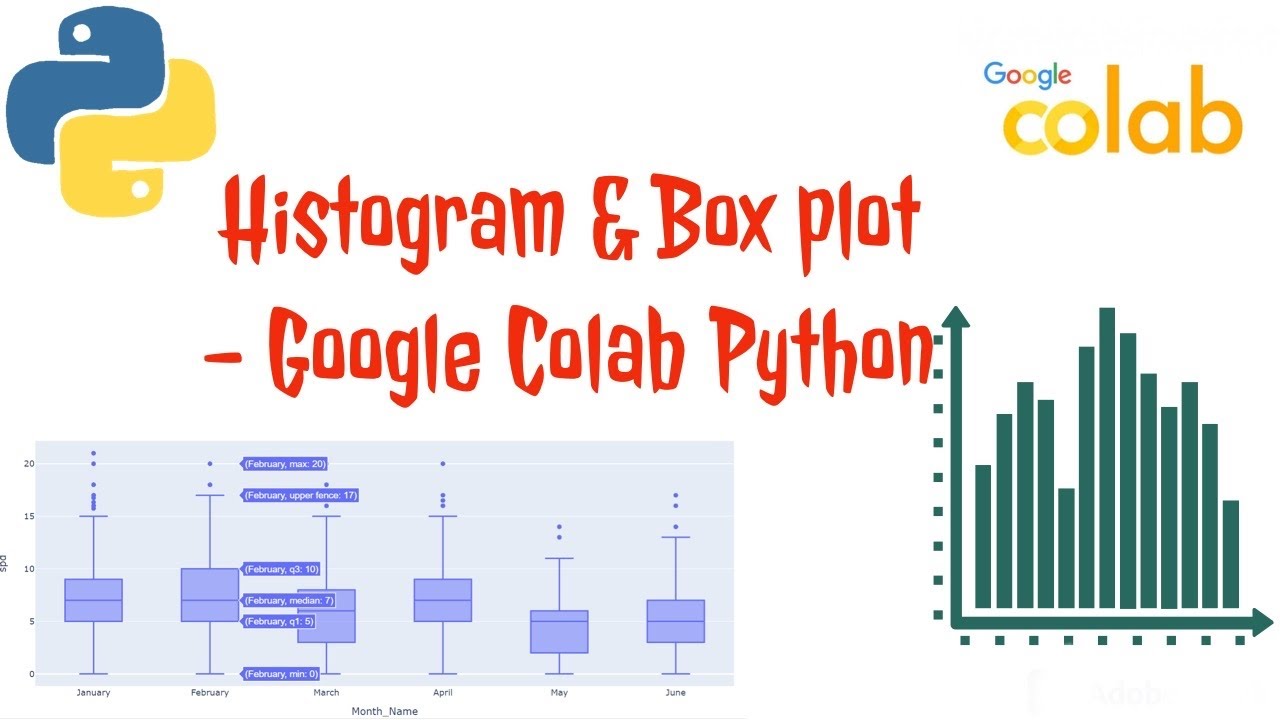
Histogram and Box plot plays a vital role in Descriptive Statistics. Both plots are used to visualized the spread range of data. Histogram shows the frequency in bar graph format whereas box plot is representation of the distribution of a variable through its quartiles.

Various types of #distribution in histogram - a) Normal Distribution, b)Right Skewed / Positively Skewed distribution, c) Left Skewed / Negatively Skewed distribution

Some the important things we need to know about box plots are,

a) Inter-Quartile Range (IQR) :Central 50% data spread, 25th Percentile to 75th Percentile of data spread. i.e., IQR = Value of 75th Percentile - Value of 25th Percentile

b) Upper Control Limit (UCL) : 75th Percentile + 1.5*IQR or Maximum

c) Lower Control Limit (LCL) : 25th Percentile - 1.5*IQR or Minimum

d) Outliers: Any value above upper control limit and any value below lower control limit

We have explained all the above statistical details related to histogram and box plot in this video.

00:00 Introduction
01:23 Creating Histogram in Google Colab Python
04:32 Right Skewed & Left Skewed Histogram
06:49 Creating Box Plot in Google Colab Python
11:56 Box plot showing relationship
14:41 Conclusion

If you have any queries please post it in comment section or at our blog - https://pakuppaivu.blogspot.com

Our Playlist - Google colab python - Google Colab Python    • Google Colab Python  

Descriptive Statistics - Box plot and Histogram in Google Colab Python

Поделиться в:

Доступные форматы для скачивания:

Скачать видео mp4

  • Информация по загрузке:

Скачать аудио mp3

Похожие видео

Correlation application on Stock Analysis- Google Colab Python

Correlation application on Stock Analysis- Google Colab Python

Выучите R за 39 минут

Выучите R за 39 минут

Data Cleaning in Pandas | Python Pandas Tutorials

Data Cleaning in Pandas | Python Pandas Tutorials

Hypothesis Testing - One Way ANOVA test - Google Colab Python

Hypothesis Testing - One Way ANOVA test - Google Colab Python

Исследовательский анализ данных с помощью Pandas Python

Исследовательский анализ данных с помощью Pandas Python

Decision Tree Machine Learning | Decision Tree Algorithm | Machine Learning | Intellipaat

Decision Tree Machine Learning | Decision Tree Algorithm | Machine Learning | Intellipaat

System Design Concepts Course and Interview Prep

System Design Concepts Course and Interview Prep

Учебник по Excel за 15 минут

Учебник по Excel за 15 минут

LLM и GPT - как работают большие языковые модели? Визуальное введение в трансформеры

LLM и GPT - как работают большие языковые модели? Визуальное введение в трансформеры

Seaborn histplot | How to make a Seaborn histogram plot with Python code

Seaborn histplot | How to make a Seaborn histogram plot with Python code

Визуализация внимания, сердце трансформера | Глава 6, Глубокое обучение

Визуализация внимания, сердце трансформера | Глава 6, Глубокое обучение

MLFlow Tutorial | ML Ops Tutorial

MLFlow Tutorial | ML Ops Tutorial

Python Seaborn - 4 | Understanding and Creating BOX PLOT using Seaborn Library in Python

Python Seaborn - 4 | Understanding and Creating BOX PLOT using Seaborn Library in Python

Pandas dataframe Trabajar y manipular datos (data wrangling)

Pandas dataframe Trabajar y manipular datos (data wrangling)

Изучите SPSS за 20 минут. БЫСТРО СТАНЬТЕ ГЕРОЕМ SPSS. ПОЛНОЕ РУКОВОДСТВО ПО SPSS ДЛЯ НАЧИНАЮЩИХ

Изучите SPSS за 20 минут. БЫСТРО СТАНЬТЕ ГЕРОЕМ SPSS. ПОЛНОЕ РУКОВОДСТВО ПО SPSS ДЛЯ НАЧИНАЮЩИХ

Градиентный спуск, как обучаются нейросети | Глава 2, Глубинное обучение

Градиентный спуск, как обучаются нейросети | Глава 2, Глубинное обучение

Matplotlib Boxplots Создание одного и нескольких ящиков в Python Учебное пособие по Matplotlib

Matplotlib Boxplots Создание одного и нескольких ящиков в Python Учебное пособие по Matplotlib

Cómo Filtrar Datos en un DataFrame de Pandas en Python (Google Colab)

Cómo Filtrar Datos en un DataFrame de Pandas en Python (Google Colab)

Но что такое нейронная сеть? | Глава 1. Глубокое обучение

Но что такое нейронная сеть? | Глава 1. Глубокое обучение

Учебник по Power BI за 10 минут

Учебник по Power BI за 10 минут

© 2025 dtub. Все права защищены.


  • Контакты
  • О нас
  • Политика конфиденциальности


Контакты для правообладателей: infodtube@gmail.com