Why Old Comic Panels Look So Much Better
Автор: Panels After Dark
Загружено: 2026-01-19
Просмотров: 26
Ever noticed the clean and simple artwork in classic "80s comic books" and "90s comics"? This video takes a look at the distinct clarity and simplicity of older "comic books", contrasting it with today's complex styles. We explore how these "classic comics" from the 80s, 90s, and early 2000s showcase a unique approach to "comic history" and art. Join the "comic discussion" as we appreciate the bold lines and purposeful strokes that define these iconic eras.
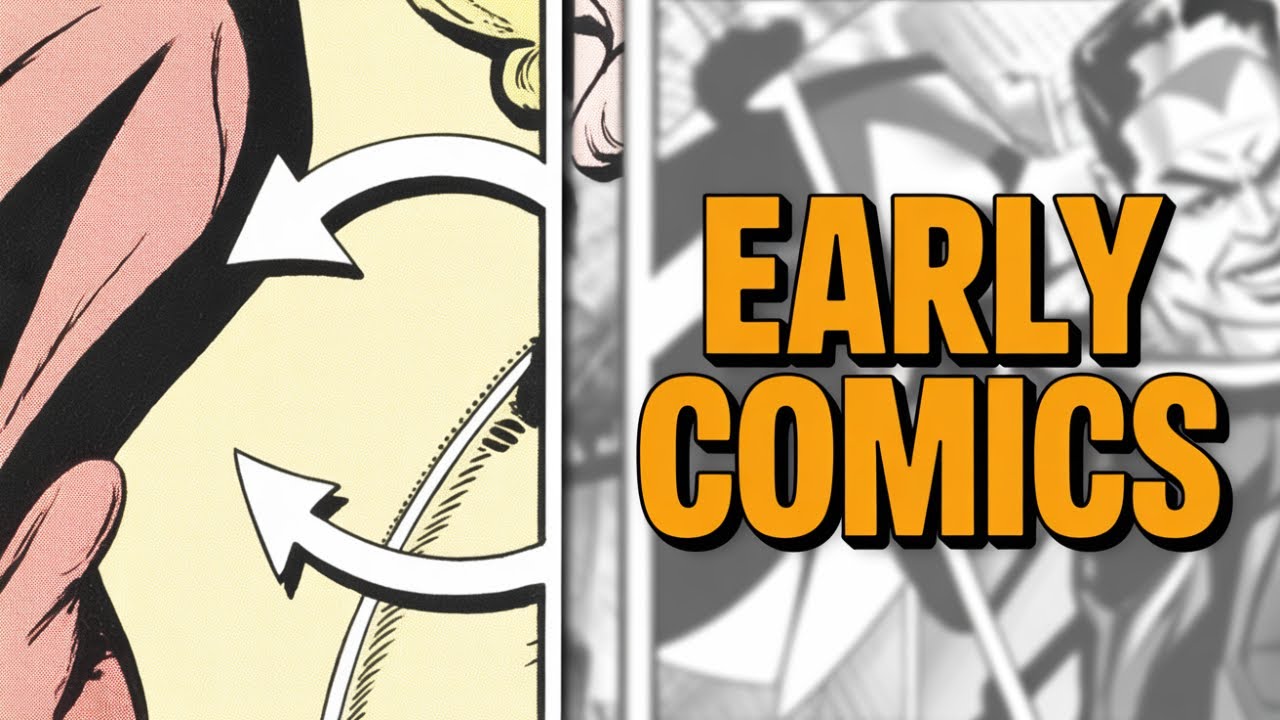
Early comic panels were incredibly clean — and it wasn’t an accident.
If you’ve ever looked at early comic book panels and wondered why they feel so clear, readable, and visually balanced, this video breaks it all down. We take a close look at how clean early comic panels really were, and why artists focused so heavily on strong line work, simple compositions, and clear storytelling.
We explore:
• Why early comic panels were designed for clarity
• The role of inking, spacing, and panel layout
• How printing limitations influenced clean art
• What modern comics can still learn from early panels
From Golden Age simplicity to Silver Age precision, this deep dive shows why less detail often meant better storytelling — and why these early panels still hold up today.
Perfect for fans of:
• Comic book art analysis
• Vintage comic panels
• Visual storytelling
• Golden Age & Silver Age comics
👍 Like if you enjoy comic art breakdowns
💬 Comment which era of comic art you prefer
🔔 Subscribe for more comic art and history deep dives
Доступные форматы для скачивания:
Скачать видео mp4
-
Информация по загрузке: