Comparative Analysis of NDVI Using Consistent Class Ranges in ArcGIS Pro Symbology
Автор: Space, Remote sensing and GIS
Загружено: 2026-01-16
Просмотров: 9
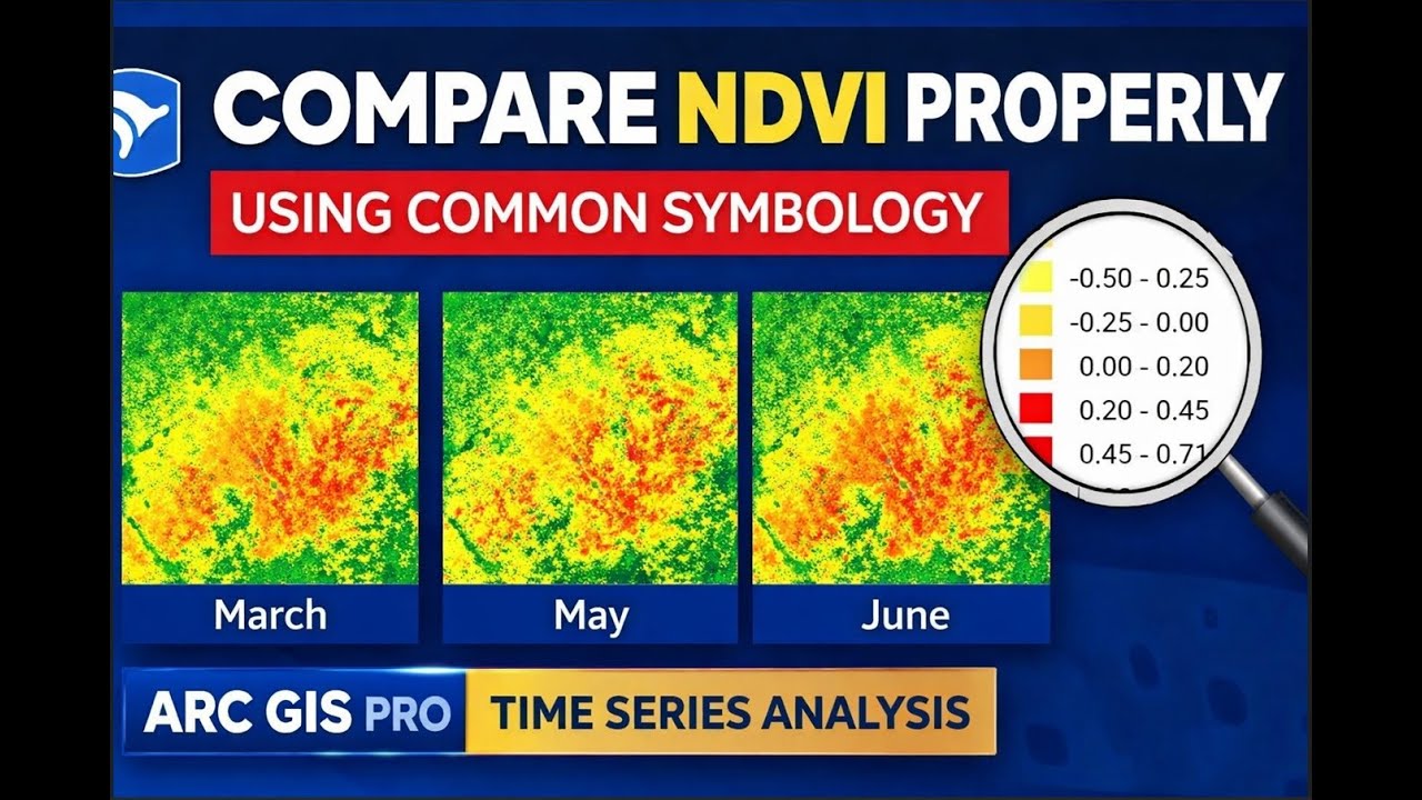
In this video, I explain how to perform a comparative analysis of NDVI using consistent class ranges in ArcGIS Pro symbology.
First, I used NDVI images from three different months. Each NDVI image was initially symbolized into five classes, but the problem was that the minimum and maximum values differed for each image. Because of this, a direct comparison was not meaningful.
To solve this, I took screenshots of the NDVI class ranges from all three images and provided them to ChatGPT with the following prompt:
“Check the symbology and make a common low-to-high value range which can show the variation between all three images, but with the legend showing the same ranges for all images.”
Based on this, I obtained a common minimum and maximum NDVI range that could be applied uniformly.
Next, I returned to ArcGIS Pro and applied this common range to the March NDVI image. To apply the same symbology to the other images, there was no need to manually enter the values again. I simply selected the May NDVI image, opened its symbology, clicked the three-dot menu, and chose Import from Layer. Since the May image was already selected, I imported the symbology from the March NDVI layer.
Once applied, the same class ranges and color scheme were automatically transferred to the May image. I repeated the same process for the June NDVI image.
Now, all three NDVI images share the same symbology, same class breaks, and same low–high value range, making it very clear which month has higher NDVI values and which month has lower values.
If you found this video helpful, please subscribe to my channel for more GIS and remote sensing tutorials.
Доступные форматы для скачивания:
Скачать видео mp4
-
Информация по загрузке:


