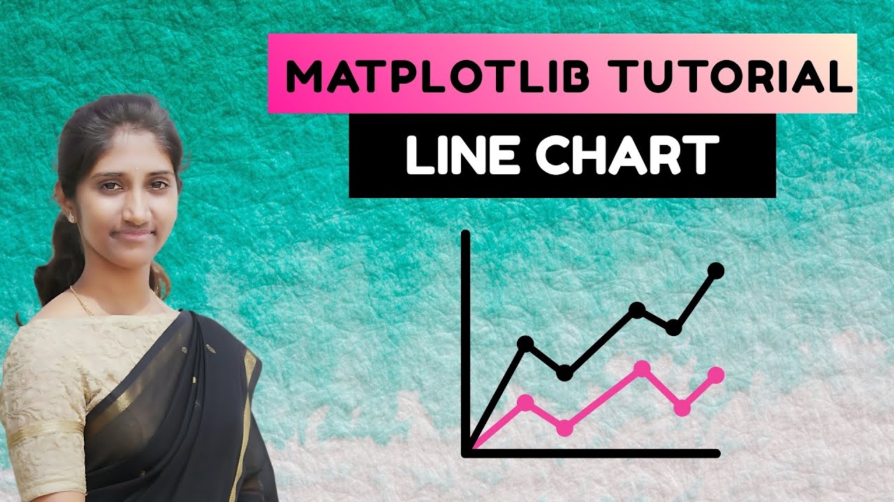
How to Create Line Chart in Python | Matplotlib Tutorial
Автор: Jeevitha Ramsudha
Загружено: 2025-11-13
Просмотров: 9
In this video, we explore one of the most widely used visualizations — the Line Chart.
You’ll learn:
📈 What a line chart is
🔹 When to use line charts
🔹 Creating line charts using Matplotlib
🔹 Plotting single and multiple lines
🔹 Customizing colors, markers, style, linewidth
🔹 Adding labels, legends, and titles
🔹 Understanding trends, patterns, and time-series data
🔹 Real-world examples (sales data, temperature, stock trends)
By the end of this video, you’ll be able to create clean, meaningful line charts that help you analyze and present data effectively.
📌 Perfect for: Python beginners, data analysts, ML learners, and anyone working with time-series or trend analysis.
👍 Don’t forget to Like, Share & Subscribe for more tutorials on NumPy, Pandas, Matplotlib, ML, and Data Science!
Доступные форматы для скачивания:
Скачать видео mp4
-
Информация по загрузке:


