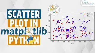
How to Create Scatter Plot in Python | Matplotlib Tutorial
Автор: Jeevitha Ramsudha
Загружено: 2025-11-13
Просмотров: 4
In today’s video, we explore one of the most powerful visualizations for understanding relationships between variables — the Scatter Plot.
You’ll learn:
🔹 What a scatter plot is
🔹 When and why we use scatter plots
🔹 Creating scatter plots using Matplotlib
🔹 Customizing colors, markers, size, and transparency
🔹 Adding labels, titles, and grids
🔹 Plotting real-world datasets (height–weight, study hours–scores, etc.)
🔹 Understanding correlation visually
🔹 When scatter plots are useful in Data Science & ML
By the end, you'll know how to create clean, insightful scatter plots that reveal patterns, trends, and relationships in your data.
📌 Perfect for: Python beginners, data analysts, ML learners, and EDA enthusiasts.
👍 Like, Share & Subscribe for more tutorials on NumPy, Pandas, Matplotlib, ML, and Data Science!
Доступные форматы для скачивания:
Скачать видео mp4
-
Информация по загрузке: