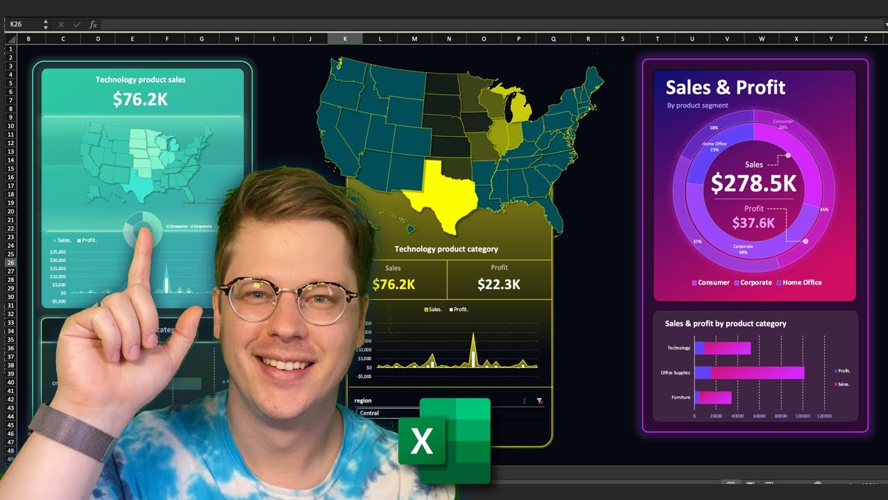
Sales Dashboard in Excel, Compare and map Data Across Regions in Excel (Template)
Автор: Project Management Mastery
Загружено: 2024-05-26
Просмотров: 802
In this video, we'll show you how to build a dynamic Excel dashboard that:
Visualizes Sales Data on a Map: Geographically map your sales and identify trends.
Compares Sales Performance: Effortlessly compare different regions and their contribution to total sales.
Analyzes Sales Trends: Uncover growth patterns and potential areas for improvement.
This step-by-step tutorial equips you with powerful Excel techniques for insightful data visualization and comparison.
✅𝙂𝙚𝙩 𝙩𝙝𝙚 𝙩𝙚𝙢𝙥𝙡𝙖𝙩𝙚 𝙝𝙚𝙧𝙚
We all need a break sometimes so if you want to take a shortcut get the template here
https://yourlifeyourproject.etsy.com/...
✅ 𝙎𝙝𝙤𝙥
My new Etsy Shop
https://yourlifeyourproject.etsy.com
🧑🎓 𝙊𝙣𝙡𝙞𝙣𝙚 𝘾𝙤𝙪𝙧𝙨𝙚𝙨
https://www.udemy.com/user/ben-m-21/
𝙈𝙮 𝙤𝙩𝙝𝙚𝙧 𝙔𝙤𝙪𝙏𝙪𝙗𝙚 𝘾𝙝𝙖𝙣𝙣𝙚𝙡𝙨
🎞️ Excel for Home
/ @excelruinedmylife
🎞️ Self Development
/ @yourlifeyourproject
excel tips, data visualization, business intelligence, sales data analysis, excel dashboard
map sales data, compare sales performance, sales trend analysis, geographic sales trends
excel tutorial, data comparison in excel, excel map charts, sales reporting, data exploration
#Excel #DataAnalysis #Sales #BusinessInsights #DataViz #MapCharts #ExcelDashboard #SalesPerformance #DataExploration #ExcelSales #GrowYourBusiness #exceltemplatesexamples

Доступные форматы для скачивания:
Скачать видео mp4
-
Информация по загрузке: