How to dynamically change the chart title in R using ggplot2
Автор: vlogize
Загружено: 2025-09-26
Просмотров: 1
Learn how to easily modify chart titles dynamically in R with ggplot2. This guide will help you create scatter plots with custom titles based on your data.
---
This video is based on the question https://stackoverflow.com/q/63035859/ asked by the user 'Sri Sreshtan' ( https://stackoverflow.com/u/13330597/ ) and on the answer https://stackoverflow.com/a/63035927/ provided by the user 'Daniel R' ( https://stackoverflow.com/u/1523693/ ) at 'Stack Overflow' website. Thanks to these great users and Stackexchange community for their contributions.
Visit these links for original content and any more details, such as alternate solutions, latest updates/developments on topic, comments, revision history etc. For example, the original title of the Question was: How to change the chart title dynamically in R?
Also, Content (except music) licensed under CC BY-SA https://meta.stackexchange.com/help/l...
The original Question post is licensed under the 'CC BY-SA 4.0' ( https://creativecommons.org/licenses/... ) license, and the original Answer post is licensed under the 'CC BY-SA 4.0' ( https://creativecommons.org/licenses/... ) license.
If anything seems off to you, please feel free to write me at vlogize [AT] gmail [DOT] com.
---
How to Dynamically Change the Chart Title in R using ggplot2
Creating visual representations of data is crucial for analysis and understanding. In R, the ggplot2 package is a powerful tool to help you create stunning charts and plots. One common requirement when plotting data is to change the chart title dynamically based on the dataset or a specific variable. In this guide, we will explore how to accomplish this using the mtcars dataset as a practical example.
The Challenge
When plotting multiple charts from a data frame, it is often useful to customize the title of each plot to reflect the data being displayed. For instance, if we segregate plots based on a variable like the number of cylinders in cars (cyl), each plotted chart should ideally show a title that includes this variable.
In our example, we want to create scatter plots that display the relationship between vs (the engine vs. a binary variable) and mpg (miles per gallon) for different values of cyl (4, 6, and 8). Initially, all plots will have the same title, but we want to modify this to reflect the current cylinder value.
Example Code Setup
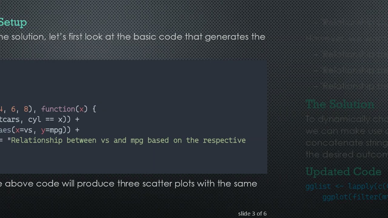
Before diving into the solution, let’s first look at the basic code that generates the initial plots:
[[See Video to Reveal this Text or Code Snippet]]
The output from the above code will produce three scatter plots with the same title:
"Relationship between vs and mpg based on the respective cyl"
However, we want to change the titles to something more informative like:
"Relationship between vs and mpg when cyl is 4"
"Relationship between vs and mpg when cyl is 6"
"Relationship between vs and mpg when cyl is 8"
The Solution
To dynamically change the title of each scatter plot based on the value of cyl, we can make use of the paste function in R. This function allows us to concatenate strings effectively. Here’s how you can modify the code to achieve the desired outcome:
Updated Code
[[See Video to Reveal this Text or Code Snippet]]
Explanation of Changes
We replaced the static title string with a dynamic one using the paste function.
Inside the function, labs(title = paste("Relationship between vs and mpg when cyl is", x)) combines a static part of the string with the dynamic value of cyl.
Expected Output
You will now receive three scatter plots each with customized titles addressing their respective cyl values. The titles will be as follows:
"Relationship between vs and mpg when cyl is 4"
"Relationship between vs and mpg when cyl is 6"
"Relationship between vs and mpg when cyl is 8"
Conclusion
By following the steps outlined above, you have successfully learned how to dynamically change chart titles in R using the ggplot2 package. This ability not only enhances the readability of your plots but also adds clarity, making your analyses more informative.
Feel free to experiment with different datasets and customize your titles to suit your needs. Happy plotting!
Доступные форматы для скачивания:
Скачать видео mp4
-
Информация по загрузке:


![Как происходит модернизация остаточных соединений [mHC]](https://image.4k-video.ru/id-video/jYn_1PpRzxI)


