Python & Excel Bar Chart Tutorial
Автор: Haider Niaz
Загружено: 2025-08-31
Просмотров: 217
Welcome to the first episode in our **Python Charts Series**!
In this tutorial, Haider Niaz walks you through:
• How to load Excel data into Python using pandas
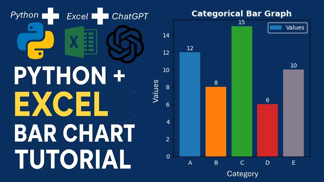
• Plotting beautiful bar charts with matplotlib and seaborn
• Customizing colors, labels, titles, and styles
Whether you're a data analyst or Excel power-user, you’ll discover how Python can level up your data visualization game.
▶ What's included:
– Step-by-step code walkthrough
– Tips on styling & labeling charts
▶ Use this tutorial to:
– Visualize Excel data quickly
– Learn Python plotting essentials
– Enhance presentations & reports
**Stay tuned for upcoming episodes**:
– Episode 2: Line Charts
– Episode 3: Pie & Donut Charts
👍 Like, comment, and subscribe for more Python + Excel tutorials from Haider Niaz!
📃 Watch related playlists and videos:
• How to make an academic poster in powerpoint
🚩 Connect with me on social:
LinkedIn: / haider-niaz-80690378
Facebook: / haider.niaz.20
If you need design-related Help, Contact me at: haiderniaz12@gmail.com
🔔 Subscribe to my YouTube channel:
/ haiderniaz
Доступные форматы для скачивания:
Скачать видео mp4
-
Информация по загрузке: