How to Create Panel Charts in Excel (Fix Messy Line Charts)
Автор: Data Viz Coach
Загружено: 2026-01-04
Просмотров: 42
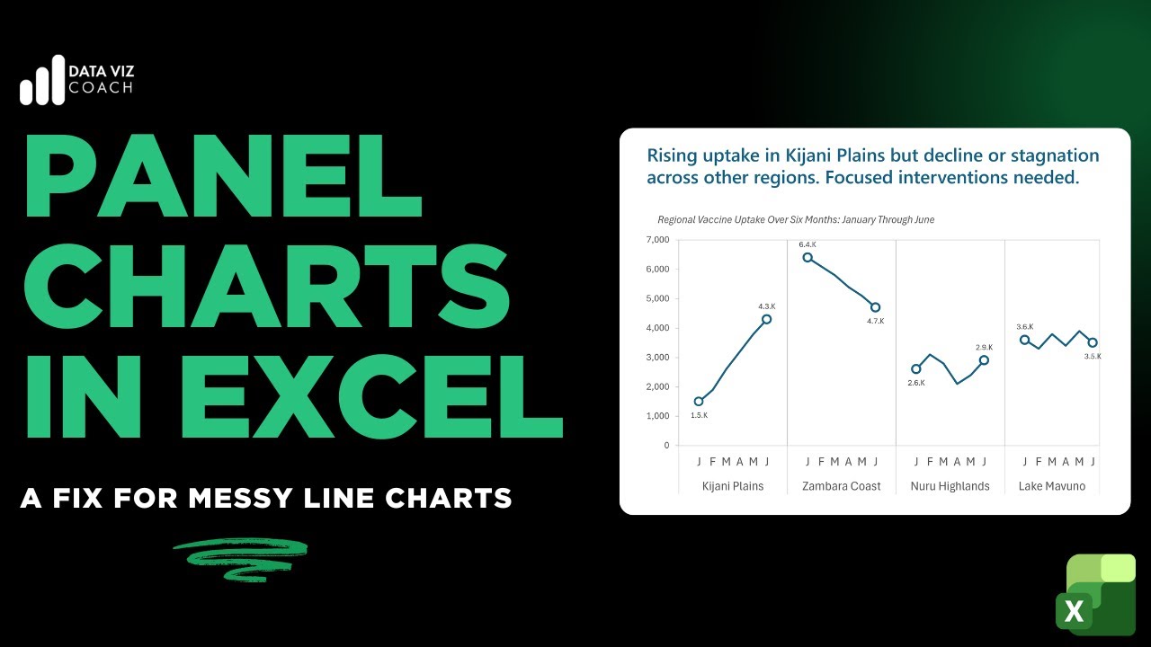
Line charts become hard to read when too many categories are plotted together. These “spaghetti charts” make it difficult to identify trends and compare performance across groups.
In this tutorial, I show you how to create panel charts in Microsoft Excel. A clean and effective alternative for fixing messy line charts.
Using a fictional vaccine uptake dataset, you’ll learn how to:
Structure your data for panel charts in Excel
Turn one cluttered line chart into multiple small, readable panels
Keep a consistent scale across panels for accurate comparison
Add visual dividers to improve clarity and interpretation
This approach is especially useful for:
Monitoring and evaluation reports.
Public health and program data
Any Excel chart with too many overlapping lines
No add-ins. No macros. Just practical Excel techniques you can apply immediately.
If you work with Excel charts and care about clarity, this tutorial is for you.
Background Music: @teatimelofi
Link to dataset: https://docs.google.com/spreadsheets/...
Доступные форматы для скачивания:
Скачать видео mp4
-
Информация по загрузке:


![Цепи Маркова — математика предсказаний [Veritasium]](https://image.4k-video.ru/id-video/QI7oUwNrQ34)


