Choosing the Right Chart
Автор: Gift Ahmed
Загружено: 2026-01-08
Просмотров: 3
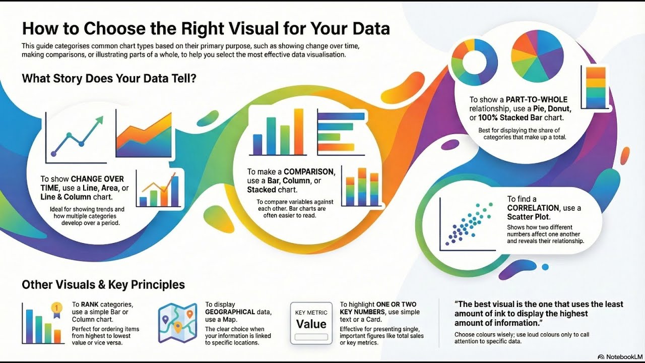
This guide outlines how to select the most effective BI visualisations based on specific data objectives, such as tracking temporal trends or performing rankings. For illustrating changes over time, the text recommends line or area charts, while bar and column charts are best suited for direct comparisons. When displaying proportions, stacked charts or pie charts are useful, though the latter should be used sparingly to maintain clarity. Relationship patterns between variables are best captured using scatter plots, whereas maps and tables serve for geographical data or precise numerical lookups. Finally, the source emphasises design principles, suggesting that colour choices and minimalism are essential for conveying information quickly and accurately.
Доступные форматы для скачивания:
Скачать видео mp4
-
Информация по загрузке: