Histogram (BIN size) and Pareto (cumulative values) charts
Автор: QuickData_Pro
Загружено: 2025-12-29
Просмотров: 20
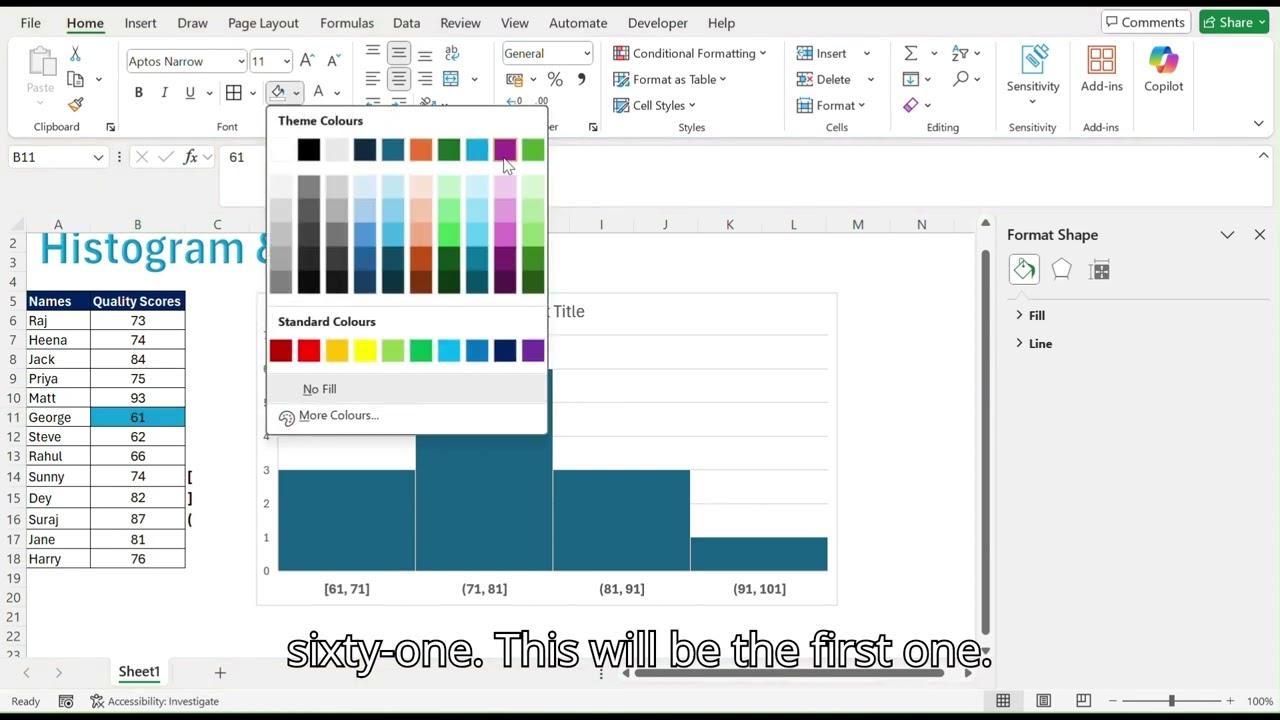
Histogram Chart
Histogram bars group categories side-by-side for easy comparisons across multiple series. Select your data, go to Recommended Charts-All Charts-Histogram Chart and customize BIN size for analysis. Perfect for visualizing quality scores, regional sales or defect types by month in your analytics projects.
Pareto Chart with Cumulative %
Combine bars (sorted descending) with a cumulative percentage line to reveal vital few contributors—80% of issues from 20% causes. In Excel/Power BI, calculate cumulative % via formulas like
example:
=SUM($C$31:C31)/SUM($C$31: $C$34), then add a secondary axis line.
#PowerBI #ExcelTips #DataViz #ParetoAnalysis #DataAnalytics
Доступные форматы для скачивания:
Скачать видео mp4
-
Информация по загрузке:


