Why Fast Food Logos Are Always Red & Yellow (It's Not a Coincidence)
Автор: 45'inde Scooter
Загружено: 2026-01-21
Просмотров: 12
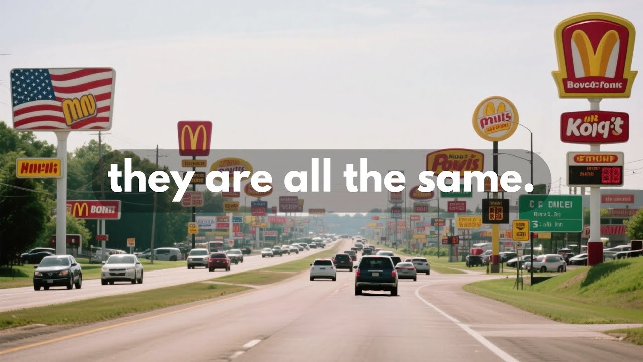
Close your eyes and picture a fast food logo. McDonald's? Red and yellow. Burger King? Red and yellow. Wendy's? Red and yellow. Pizza Hut? Red and yellow. In-N-Out? Red and yellow.
This isn't a coincidence, and it isn't just because those colors look nice together. It is a calculated psychological attack on your brain known as the "Ketchup and Mustard Theory."
In this video, we break down the color psychology behind these billion-dollar brands. We explain how red triggers physical urgency and hunger, how yellow hijacks your feeling of comfort, and why fine dining restaurants use the exact opposite colors to make you stay longer.
#psychology #marketing #fastfood #design #facts #mindgames #colorpsychology #mcdonalds #business
Доступные форматы для скачивания:
Скачать видео mp4
-
Информация по загрузке: