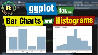
Plotting Histograms in R: A Guide to Understanding Your Data
Автор: vlogize
Загружено: 4 апр. 2025 г.
Просмотров: 0 просмотров
Learn how to create and customize histograms in R using ggplot2 to visualize scores for different names in your dataset.
---
This video is based on the question https://stackoverflow.com/q/69073641/ asked by the user 'RasK' ( https://stackoverflow.com/u/12657796/ ) and on the answer https://stackoverflow.com/a/69073772/ provided by the user 'PesKchan' ( https://stackoverflow.com/u/14010653/ ) at 'Stack Overflow' website. Thanks to these great users and Stackexchange community for their contributions.
Visit these links for original content and any more details, such as alternate solutions, latest updates/developments on topic, comments, revision history etc. For example, the original title of the Question was: Plotting Histograms in R
Also, Content (except music) licensed under CC BY-SA https://meta.stackexchange.com/help/l...
The original Question post is licensed under the 'CC BY-SA 4.0' ( https://creativecommons.org/licenses/... ) license, and the original Answer post is licensed under the 'CC BY-SA 4.0' ( https://creativecommons.org/licenses/... ) license.
If anything seems off to you, please feel free to write me at vlogize [AT] gmail [DOT] com.
---
Plotting Histograms in R: A Guide to Understanding Your Data
Data visualization is a powerful way to understand and communicate insights from your datasets. One of the most effective methods for visualizing the distribution of a numerical variable is through histograms. If you're working with R, particularly with the ggplot2 library, you can easily create informative histograms. This guide will guide you on how to plot histograms for individual names in your dataset with respect to their scores.
Introduction
Let's say you have a dataset containing names and their corresponding scores, as shown below:
NameScoreAnna40David30Juli20Anna20David50Juli40Anna20David20Juli20In this post, we will learn how to plot histograms for each individual, Anna, David, and Juli, based on their scores using R and ggplot2.
Setting Up Your Data
Before we dive into plotting, let’s first prepare our data. Here’s an example of how you could create a similar dataset in R:
[[See Video to Reveal this Text or Code Snippet]]
Explanation:
We use set.seed() to ensure that our random numbers are the same every time we generate them.
We create a data frame with names and scores to mimic the dataset you have.
Plotting Histograms
Now that we have our data set up, we can use ggplot2 to create histograms for each person. Here's how:
Basic Histogram
To create a basic histogram for the scores of Anna, David, and Juli, you can use the following code:
[[See Video to Reveal this Text or Code Snippet]]
Explanation of Key Parts:
aes(x=Score): This specifies that we want to plot the Score variable.
geom_histogram(): This function creates the histogram.
binwidth=5: This controls the width of the bins in the histogram.
facet_wrap(~ Name): This splits the histogram by name, allowing us to see each person's score distribution in a separate plot.
labs(): This adds titles and labels to your plot.
theme_minimal(): This applies a clean and minimalistic theme to the plot.
Customizing Your Histogram
Feel free to customize your histogram's appearance by changing colors, bin widths, or additional settings. Here’s an example of further customization:
[[See Video to Reveal this Text or Code Snippet]]
Key Customizations:
Change the fill color to adjust the fill color of the bars.
Modify the theme to control the overall style of your histogram.
Conclusion
Creating and customizing histograms in R using ggplot2 is a straightforward process that can significantly enhance your data visualization capabilities. By following the steps outlined in this guide, you can easily generate histograms to showcase how scores differ among individuals in your dataset.
Whether you are conducting research, preparing a report, or simply looking to understand your data better, histograms can provide valuable insights. Experiment with different settings and customizations to create the perfect histogram for your needs!

Доступные форматы для скачивания:
Скачать видео mp4
-
Информация по загрузке: