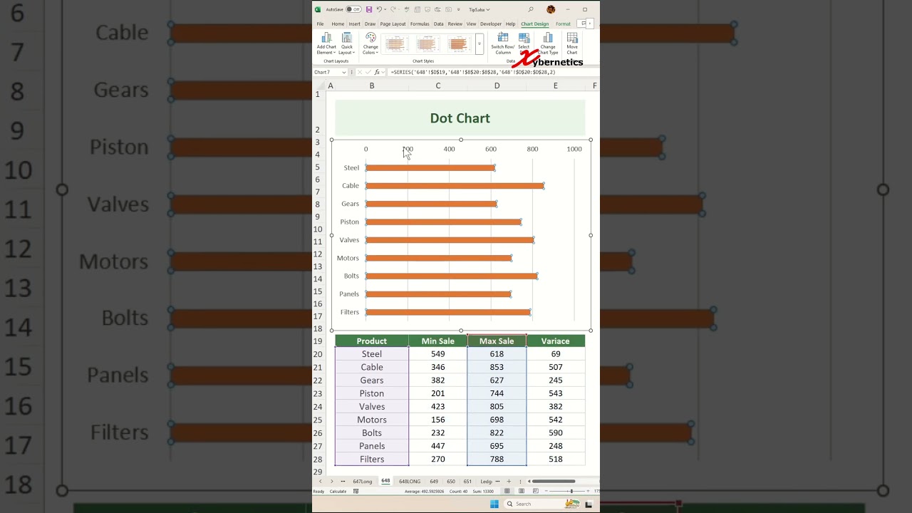
Dot Chart in Excel - Excel Tips and Tricks
Автор: Jasmine Jones
Загружено: 2024-12-22
Просмотров: 1557
Learn how to create dot plot chart in Excel.
Insert Chart
1) Select dataset
2) Alt+F1
3) Resize and reposition
Change Chart Type
1) Chart type
2) Combo
3) Max Qty to "Cluster bar"
4) Min Qty to "Stacked bar"
5) Variance to "Stacked bar"
6) Only Max Qty with "Secondary Axis" checked.
7) OK
Swap Axes
1) Add Chart Element ~ Axes ~ Secondary Vertical
2) Select on Primary Y-Axis
3) Ctrl+1
4) Category in reverse order
5) Click on Secondary Vertical (Category) Axis
6) Category in reverse order
7) Delete title, secondary axis, legend and x-axis
Error Bars For Max Sale
1) Add Chart Element ~ Error Bars ~ Percentage
2) Select Error Bars
3) Minus
4) No cap
5) Percentage = 0.1
6) Lines and Fill
Solid Line
Color = Blue
Width = 2 pt
Begin arrow type = Oval arrow
End arrow type = Oval arrow
Hide Max Sale
1) Select Max Sale
2) No Fill
Error Bars For Min Sale
1) Select Min Sale
2) Add Chart Element ~ Error Bars ~ Percentage
3) Min Sale Y Error Bars
4) Minus
5) No cap
6) Percentage = 0.1
7) Lines and Fill
Solid Fill
Color = Red
Width = 2 pt
Begin arrow type = Oval arrow
End arrow type = Oval arrow
Hide Min Sale
1) Select Min Sale
2) No Fill
Error Bars for Variance
1) Select Variance
2) Add Chart Element ~ Error Bars ~ Percentage
3) Select Variance Y Error Bars
4) Minus
5) No cap
6) Percentage = 100
7) Lines and Fill
Solid Fill
Width = 1.5 pt
Hide Variance
1) Select Variance
2) No Fill
Max and Min Data Labels
1) Select Max Sale
2) Add Chart Element ~ Data Label ~ Outside End
3) Select Min Sale
4) Add Chart Element ~ Data Label ~ Inside End
#excel #tips #shorts #fyp
Доступные форматы для скачивания:
Скачать видео mp4
-
Информация по загрузке:


