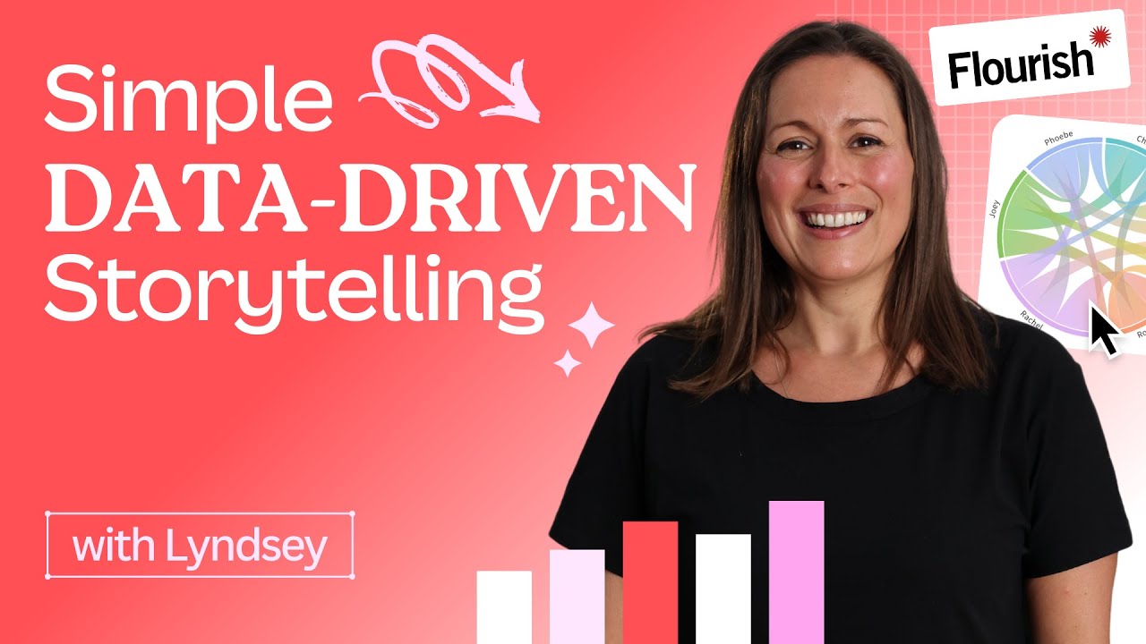
Master Data-Driven Storytelling: Boost Your Marketing Impact with Flourish and Canva
Автор: Canva
Загружено: 2023-06-14
Просмотров: 35772
Discover the power of storytelling in marketing and dive into the world of data visualization and information graphics using Flourish and Canva. Learn how to create engaging, interactive, and visually stunning marketing materials that stand out in a cluttered, competitive world. We’ll walk you through the process of transforming your data into dynamic number tickers, doughnut charts, and interactive maps, all while maintaining your brand's consistency. Elevate your marketing reports and presentations by incorporating these eye-catching visuals, and even convert them into websites or social media content with ease. #StorytellingInMarketing #DataVisualization #InformationGraphics #Flourish #Canva #EngagingContent #InteractiveGraphics #VisualMarketing #DynamicCharts #BrandConsistency #MarketingReports #DataDrivenDesign #SocialMediaContent
💡 WHAT YOU'LL LEARN
► How storytelling and infographics can enhance marketing presentations,
► Using Flourish to create dynamic data visualizations,
► Make number tickers, doughnut charts, and interactive maps,
► Incorporating Flourish visualizations into Canva designs,
► Converting presentations into websites or social media content with Canva.
⏳ TIMESTAMPS
00:00 Intro
00:29 What is Flourish, and how does it work with Canva?
01:24 The importance of number tickets to help gain attraction to data visuals
02:58 How to turn static pie charts into customized data visualization stories
04:23 How to create interactive visualizations for users in real-time
05:24 Ways to adapt interactive visualizations into social media posts and websites
06:10 How to share your project with others through a QR code
06:29 Wrapping up
Lyndsey leads the Professional Services team at Flourish, where she works on data storytelling projects to help customers realize the full value of Flourish for their businesses. As an experienced economist who has specialized in the data visualization and storytelling field, Lyndsey was the Bank of England's first data visualization editor. In this role, she produced and advised on the best use of charts and infographics to tell compelling stories with data, focusing on explaining the economy and the Bank's work to various audiences, including the public, journalists, and technical stakeholders.
💻 Try it out today: https://canva.me/e/create-worksheets
👍 Enjoyed this video? Hit the "Like" button to see more in your feed.
🔔 Subscribe so you never miss our new videos: https://bit.ly/YTCanvaDirectSub
_
⛏ PLAYLISTS FOR YOU TO DIG DEEPER:
► Try our "Canva for Beginners" Free Course:
https://bit.ly/37KAvvT
► Dive into more tips from the team
https://bit.ly/3XeHe8M
► Learn direct from professional designers:
https://bit.ly/3DXraBD
► Check out our Canva step-by-step tutorials for freelancers and small businesses:
https://bit.ly/3i6rUu3
► Discover short Canva Tips & Tricks:
https://bit.ly/3BekZFu
_
About Canva:
Canva is the world’s most inclusive design platform that lets anyone design anything and publish anywhere. Canva can help you express ideas, unleash your creativity and achieve your goals. Available in 100 languages and on any device, start with one of Canva’s 615,000 templates and see where your creativity takes you.
❤️ Try Canva now for free: https://canva.me/design-on-canva
Доступные форматы для скачивания:
Скачать видео mp4
-
Информация по загрузке: