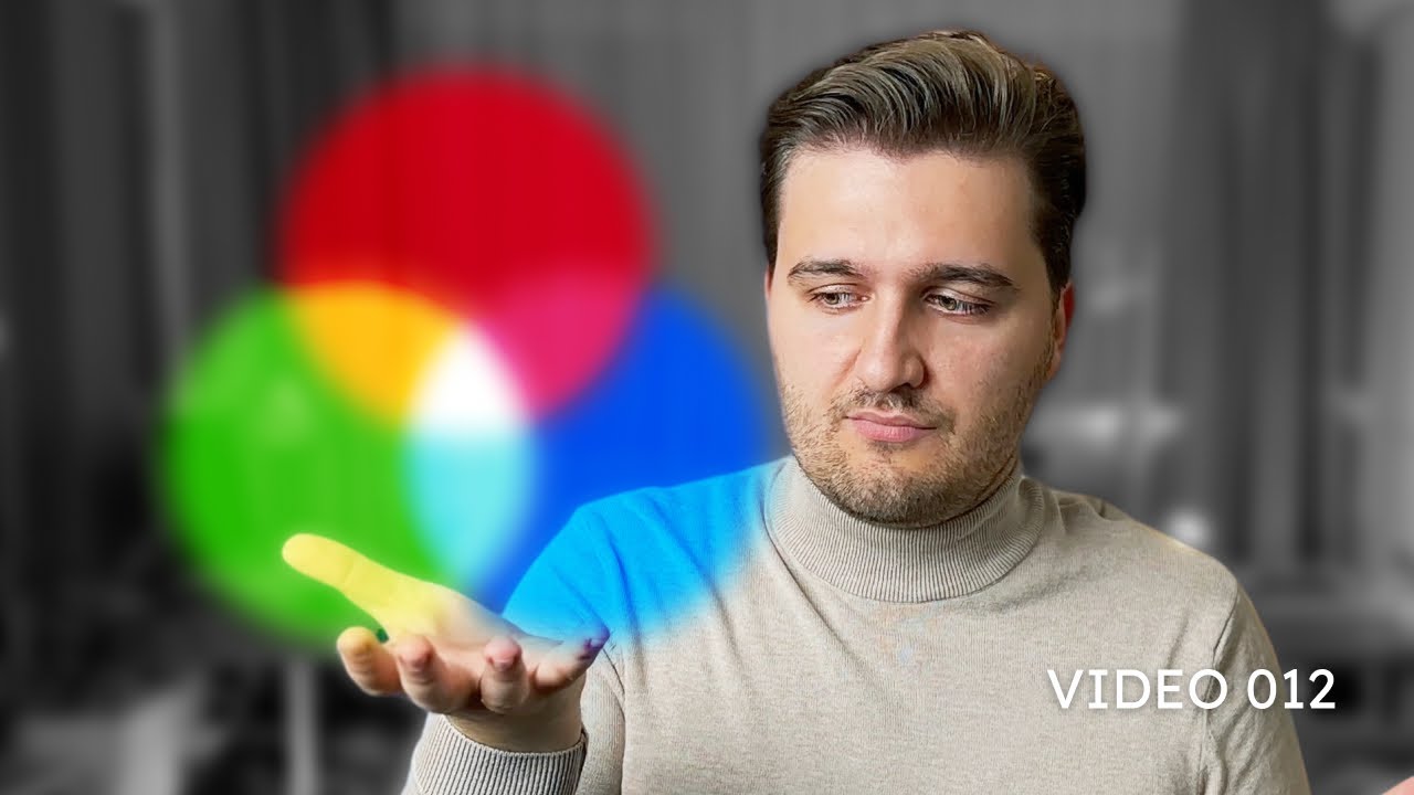
RGB vs. CMYK: Understanding Color Modes
Автор: Zivkology
Загружено: 12 янв. 2025 г.
Просмотров: 48 просмотров
💬 Join the Zivkology Community on / discord
Connect with designers and clients, share insights, and ask questions in dedicated channels.
Ever wondered why your designs look vibrant on screen but dull in print? 🎨 In this video, we dive into the differences between RGB and CMYK color modes, exploring how they work and when to use each one. From screens to print, this is your essential guide to mastering colors in design.
👉 What You’ll Learn:
The difference between additive (RGB) and subtractive (CMYK) color systems.
Why RGB is for screens and CMYK is for print.
The importance of color gamuts like Adobe RGB and sRGB.
How Pantone helps maintain color consistency across mediums.
💬 Have questions or insights? Share them in the comments below!
🔗 Follow Me on Social Media for More Design Insights:
Instagram: @zivkologyy
TikTok: @zivkology
Facebook: @zivkology
Hit subscribe for more design essentials and creative tips! 🚀
Chapters:
0:00 Introduction
0:30 What Are RGB and CMYK?
2:00 Additive vs. Subtractive Color Systems
4:00 Why RGB is for Screens and CMYK is for Print
6:00 Color Gamuts: sRGB, Adobe RGB, and P3
8:00 Pantone: Solving Color Consistency Issues
10:30 Recap: Key Takeaways for Designers
Hashtags:
#ColorTheory #RGBvsCMYK #DesignTips #GraphicDesign #Zivkology #ColorModes #PrintVsScreen #CreativeJourney

Доступные форматы для скачивания:
Скачать видео mp4
-
Информация по загрузке:


![How are Images Compressed? [46MB ↘↘ 4.07MB] JPEG In Depth](https://ricktube.ru/thumbnail/Kv1Hiv3ox8I/mqdefault.jpg)


