How to Easily Create a Blurred Background Effect in CSS (backdrop-filter)
Автор: Web Dev & Code
Загружено: 2025-12-16
Просмотров: 71
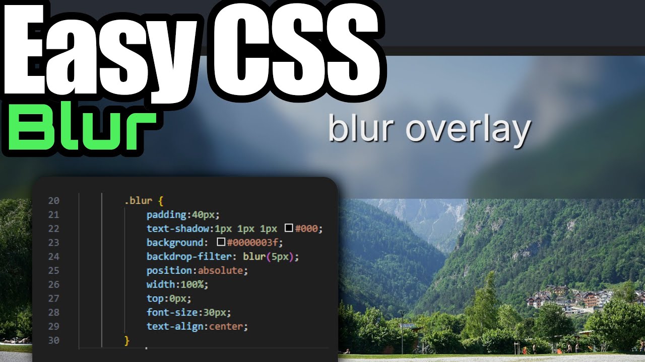
I just discovered one of the coolest and easiest CSS properties for creating blurred UI elements: backdrop-filter!
If you've ever wanted to create that modern "frosted glass" or "glassmorphism" effect where an overlay blurs the background behind it, this tutorial is for you.
In this quick video, I show you how to stop using complicated workarounds. We'll build a simple HTML structure, add a background image, and then apply the magic backdrop-filter: blur() property to an overlay div to instantly blur the background. It's super easy and looks awesome!
Image Credit: Photo by Alexandre Moreira: https://www.pexels.com/photo/scenic-l...
⌚ Timestamps 🏹
0:00 About this magic filter
0:16 Starting Off Main Div Wrap
0:29 Adding a background image
1:02 Adding the Overlay
1:51 Adding the Magic Blur Filter (backdrop-filter)
2:29 Adjusting the amount of Blur
2:58 Moving the Blur Overlay (Positioning)
3:20 Testing blur on the Main Background
4:00 Removing the Background Color (It still works!)
Доступные форматы для скачивания:
Скачать видео mp4
-
Информация по загрузке:


![Курс по Верстке сайтов с Нуля для Начинающих [aroken.ru]](https://image.4k-video.ru/id-video/eMhhl1Wq8JA)


