Recreating a labelled dumbbell chart in R showing people's openness to the COVID-19 vaccine (CC136)
Автор: Riffomonas Project
Загружено: 2021-08-12
Просмотров: 4623
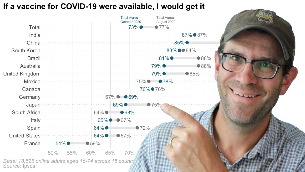
In December 2020, Ipsos released a report that contained a labelled dumbbell chart (also called a barbell chart or plot) that showed the percentage of people who said they would likely receive the COVID-19 vaccine once it was available. I thought this was an interesting figure, in part, because of how it depicted paired data. In this episode we'll recreate the original plot in R so that in future episodes we can modify it and experiment with other ways of representing the data.
Pat uses functions from the tidyverse including functions from the #ggplot2, #dplyr, #ggtext and #glue packages in #RStudio. The accompanying blog post can be found at https://www.riffomonas.org/code_club/....
If you're interested in taking an upcoming 3 day R workshop, email me at riffomonas@gmail.com!
R: https://r-project.org
RStudio: https://rstudio.com
Raw data: https://github.com/riffomonas/raw_dat...
Workshops: https://www.mothur.org/wiki/workshops
You can also find complete tutorials for learning R with the tidyverse using...
Microbial ecology data: https://www.riffomonas.org/minimalR/
General data: https://www.riffomonas.org/generalR/
0:00 Introduction
3:51 Reading and formatting CSV file
5:55 Creating a Cleveland dot chart
7:42 Creating a Dumbbell chart
8:07 Adding labels to Dumbbell chart
14:48 Modifying the size aesthetic for points, lines, and text
15:59 Matching and specifying color scheme
18:27 Specifying the x- and y-axis values
20:25 Modifying figure titles and axis labels
23:38 Replacing a legend with text call outs
30:59 Adjusting the theming to match original figure
32:49 Recap
Доступные форматы для скачивания:
Скачать видео mp4
-
Информация по загрузке:


