The Best Way to Write Single Stroke Gothic Capitals
Автор: PAScribe
Загружено: 2025-10-10
Просмотров: 327
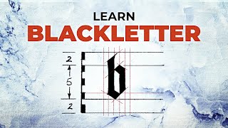
Here is the whole Monoline Standard Alphabet.
You can really see it holding unto the grid. It is from this understanding of line interaction and spacing the internal balance of the letter is expressed.
Once you can see this, and feel it, writing it with a broad edged nib becomes considerable easier.
The order here is different from the ‘Angular Alphabet’ which I teach first, and which some students have stayed with as they find the ‘Standard Alphabet’ more difficult to write.
This is an excerpt from my ‘2025 Textualis Quadrata 2day Workshop’ which is available in the PAScribe Scriptorium’ See the link below.
This video is from day one which focuses on ‘Monoline’ writing to teach where the skeletal structure lies. Understanding movement in the writing and where the monoline marks live, help with a sense what the internal spacing of the letter feels like.
https://pascribe-scriptorium.newzenle...
@pascribe
#pascribe #calligraphy #handwriting #flourishing #gothic #textualis #textura
Follow Us:
http://PAScribe.com
https://www.instagram.com/pascribe/?h...
/ pascribe
/ paul-antonio-scribe-110088289117604
https://pascribe-community.circle.so

Доступные форматы для скачивания:
Скачать видео mp4
-
Информация по загрузке: