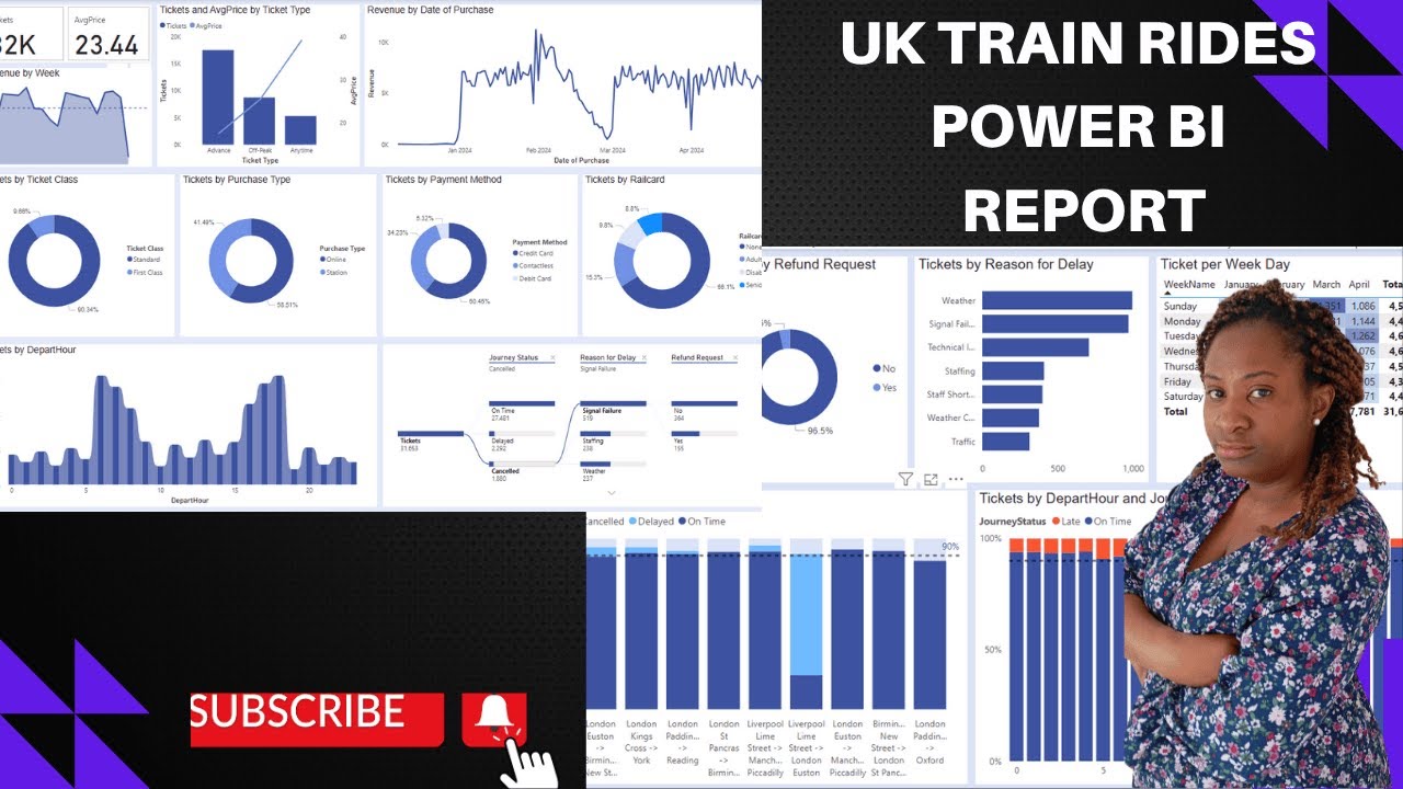
How to Design a Power BI Dashboard Using UK Train Data
Автор: Rx Tutorials: Data and AI
Загружено: 2025-06-01
Просмотров: 508
Learn how to design a compelling and interactive Power BI dashboard using real UK train data provided by Marven Analytics. In this step-by-step tutorial, we walk you through data import, transformation, and visualization to create a dashboard that delivers powerful insights into train performance, delays, and ridership patterns.
Whether you're a beginner or looking to polish your Power BI skills, this video will help you build a dashboard from scratch with industry-level data.
🔍 What you'll learn:
Designing impactful visuals and KPIs
Tips for making your dashboard interactive and user-friendly
💼 Perfect for:
Data analysts
Power BI learners
Transport and logistics professionals
Anyone interested in UK public transportation data
Don't forget to like, comment, and subscribe for more data visualization content!
Доступные форматы для скачивания:
Скачать видео mp4
-
Информация по загрузке:


