Create a Scatter Plot in R with ggplot2 - Labels, Legends and More
Автор: R Studio Helper
Загружено: 2023-02-07
Просмотров: 514
Thank you for watching my first ever video!
0:00 Intro
0:22 Cheat Sheet
0:40 Packages/Libraries
1:26 Data
2:01 ggplot2 Basics
3:08 geom_functions
4:55 Categorical Variable
5:38 Smoothing Line
6:52 Theme
7:30 Labels
8:32 Legends
11:42 Outro
Links: (I apologize that these are not clickable. My account is still too new so youtube won't allow me to post clickable links.)
ggplot2 cheat sheet: posit.co/resources/cheatsheets/
tidyverse documentation: cran.r-project.org/web/packages/tidyverse/vignettes/paper.html
ggplot2 documentation: ggplot2.tidyverse.org/
mtcars documentation: www.rdocumentation.org/packages/datasets/versions/3.6.2/topics/mtcars
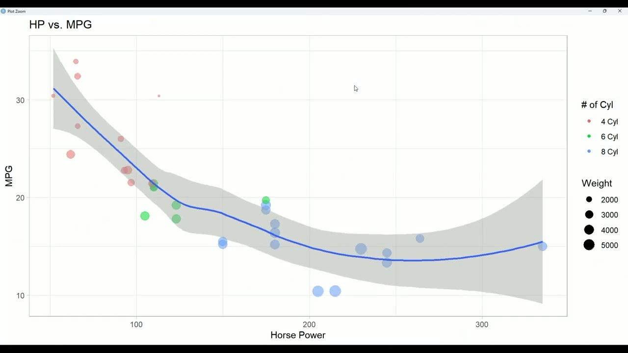
In this video, we go through a beginner example of how to make a scatterplot in R with ggplot2.
We use mtcars as our dataset plotting hp on the x axis and mpg on the y axis.
We color the points by number of cylinders and change the size to reflect the weight.
We add a smoothing line.
We change the theme.
We add a title and change the axis labels.
We remove a legend and change the legend title and labels of 2 more.
Let me know what video you want to see next!
Please like and subscribe if this helped you
Доступные форматы для скачивания:
Скачать видео mp4
-
Информация по загрузке:


![Как сжимаются изображения? [46 МБ ↘↘ 4,07 МБ] JPEG в деталях](https://image.4k-video.ru/id-video/Kv1Hiv3ox8I)


![Как происходит модернизация остаточных соединений [mHC]](https://image.4k-video.ru/id-video/jYn_1PpRzxI)


