TABLEAU SLOPE CHART
Автор: Art of Visualization
Загружено: 2018-07-31
Просмотров: 10988
Become a cutting-edge TABLEAU expert in as little as 8 HOURS with our newest data science online course — now 95% off.
Dive into all that Tableau 2018 has to offer and take your data science career to whole new heights with “Tableau 2018: Hands-On Tableau Training For Data Science” — currently rated 4.6/5 on Udemy.
Learn by doing with step-by-step lectures, real-life data analytics exercises and quizzes.
=================================================
95% OFF — A limited time, YouTube ONLY offer!
Enroll today ==> https://www.udemy.com/tableau-2018/?c...
=================================================
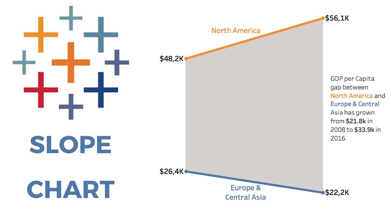
The slope chart is a variation of the line chart and excellent for comparing two or more values in your dimension across two discrete time periods. It is not a very complicated chart, but to make it look good does require some manual steps. In this tutorial, we create a slope chart complete with a shading background and talk about some further ways on how to improve on the look.
Доступные форматы для скачивания:
Скачать видео mp4
-
Информация по загрузке: