Скачать
Excel: Graphing with separate Error Bars of Standard Deviation
Автор: Peter Stanley
Загружено: 2015-09-25
Просмотров: 634278
Описание:
If this was useful, please SUBSCRIBE and I'll keep the tutorials coming.
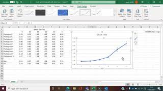
Here is a short tutorial on how to convert a simple data table into a scatter plot graph with error bars of standard deviation. I made this for my biology students, but hope it helps others as well.
This was made in Excel 2016 on a MacBook Pro... using Screen-o-matic.

Доступные форматы для скачивания:
Скачать видео mp4
-
Информация по загрузке: