ggplot2: From Bad Pie Charts to Polished Bars & Animation - Step by Step
Автор: StatistikinDD
Загружено: 2021-04-24
Просмотров: 1293
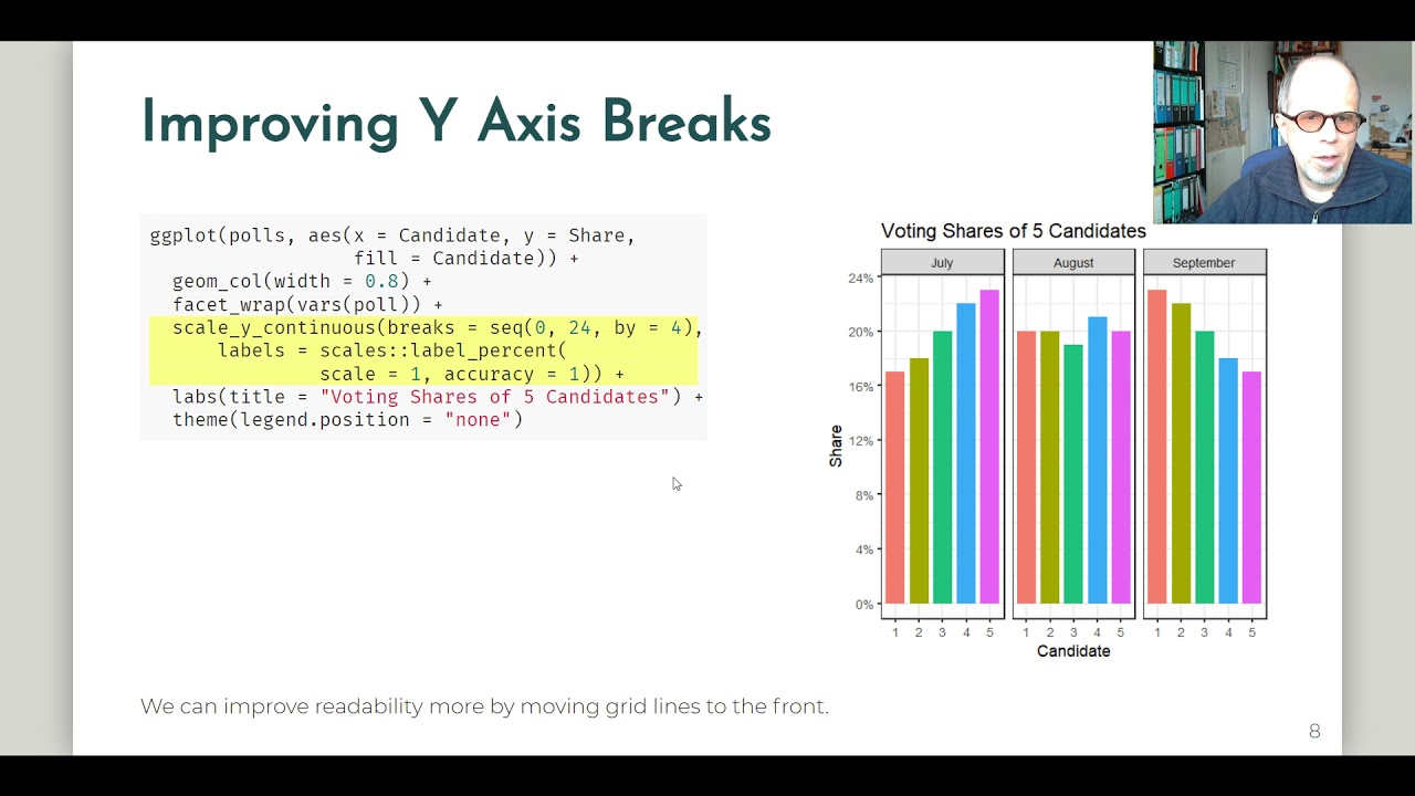
Even when the data is very simple, we can put in some effort to improve on our first plot attempt. Starting out with pie charts, we quickly see why they are not well suited for displaying our data. We move on to bar charts and gradually improve them, focusing on both readability and visual aspects. One design choice is to reduce unnecessary information. To that end, we improve on the y axis rather than labelling all our data points. Besides, we adjust theme aspects like horizontal and vertical grid lines, and the strips that hold facet labels.
Finally we turn our static plot into an animation with very little additional effort, using the gganimate package.
Code / presentation can be found on my github profile:
https://github.com/fjodor/dataviz_ideas
The data is created in-line in the markdown document.
Contact me, e. g. to discuss (online) R workshops / trainings / webinars:
LinkedIn: / wolfriepl
Twitter: / statistikindd
Xing: https://www.xing.com/profile/Wolf_Riepl
Facebook: / statistikdresden
https://statistik-dresden.de/kontakt
R Workshops: https://statistik-dresden.de/r-schulu...
Blog (German, translate option): https://statistik-dresden.de/statisti...
Playlist: Music chart history
• Music Chart History
Доступные форматы для скачивания:
Скачать видео mp4
-
Информация по загрузке:


