Seaborn Python Tutorial - Part 1
Автор: Yiannis Pitsillides
Загружено: 2019-11-13
Просмотров: 50505
Seaborn Python Tutorial 2020. Learn how to use Seaborn to visualize and analyse your data in Python. Learn when to use which plot and why; depending what you are trying to achieve. Additionally, learn how to interpret the results you see in your plot.
Support the channel on Patreon:
/ data360yp
Data Analytics Course Link:
http://ipidata.teachable.com/
In the first video of the series, I cover extensively LinePlots, BarPlots and Histograms.
Part 1 Link: • Seaborn Python Tutorial - Part 1
Part 2 Link: TBC
Part 3 Link: TBC
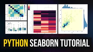
Tutorial Overview:
• What is Seaborn and how/why it's used
• Trend Plots:
o Line Plots
• Summary Plots:
o Bar Plots
• Distribution of Data:
o Histogram
o Box Plots
• Relationship Plots:
o Scatter Plots
o lmplot (combo of regplot() and FacetGrid)
• Holistic views / Combo:
o Sub Plots
o Pair Plots
o Join Plots
• Correlation / Relationships:
o Heat Map
How to download and install Python through Anaconda:
• How to Download PYTHON for FREE
Data Analytics Course Link: http://ipidata.teachable.com/
Download the raw data & the Python Notebook:
https://github.com/Pitsillides91/Pyth...
Yiannis Pitsillides on Social Media:
/ pitsillides91
https://www.instagram.com/ypexists/?h...
https://www.pinterest.co.uk/pitsillid...
/ 1500092413449073

Доступные форматы для скачивания:
Скачать видео mp4
-
Информация по загрузке:


![Machine Learning Tutorial for Beginners – Linear Regression Example in Python [Part 1]](https://ricktube.ru/thumbnail/Q0Q4x58h_BA/mqdefault.jpg)