How to Make Perfect XY Scatter Plots for Chemistry Labs | Stop Losing Points on Your Lab Graphs!
Автор: Biochem Brooke
Загружено: 2026-01-08
Просмотров: 55
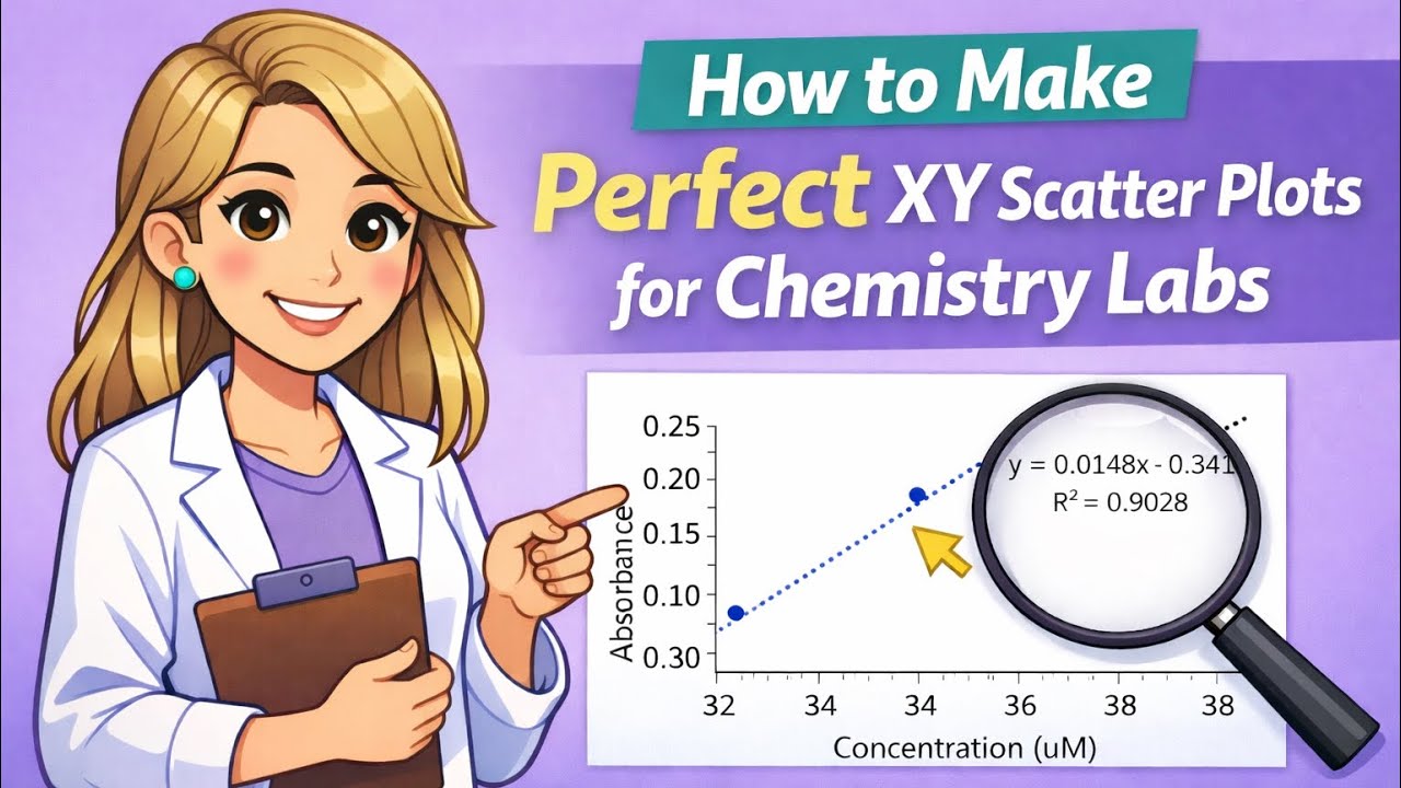
Struggling to make professional-looking graphs for your chemistry lab reports? 🧪 This tutorial shows you exactly how to make XY scatter plots that follow proper chemistry lab standards!
In this step-by-step guide, you’ll learn how to:
✅ Switch your data between the X and Y axes
✅ Remove major gridlines for a clean look
✅ Add and format axis tick marks
✅ Properly label your X and Y axes
✅ Add a linear trendline with equation and R² value
✅ Format numbers in scientific notation and control decimals
✅ Adjust axis bounds to minimize white space
✅ Delete the default chart title holder
⏱ Timestamps
00:00 - Introduction
00:30 - Inserting Scatterplot
01:08 - Switching X and Y Data
01:55 - Removing Major Gridlines
02:11 - Adding Axis Tick Marks
02:42 - Adding Axis Labels
03:32 – Deleting Default Chart Title
03:53 – Adding Linear Trendline with Equation & R²
05:06 – Formatting Axis Numbers to Scientific Notation
05:30 - Changing Decimal Places for Axis Numbers
05:48 – Formatting Trendline Equation to Scientific Notation
06:08 - How to Copy Graph as a Photo (Best Quality)
07:45 – Adjusting Axis Bounds to Minimize Empty White Space
This method is perfect for General Chemistry, AP Chemistry, Organic Chemistry, or any lab course where clear, precise graphs are required.
💡 Make your lab reports stand out, impress your TA or professor, and save time with these professional graphing tips!
📌 Like, comment, and subscribe for more chemistry tutorials that make learning easier.
#ChemistryGraphs #XYScatterPlot #LabReportTips #Trendline #ExcelTutorial #ChemistryLab #ScienceStudents #GraphingTips
Доступные форматы для скачивания:
Скачать видео mp4
-
Информация по загрузке:


![How to Instantly Create a Chart with Alt + F1 in Excel [2026 Guide]](https://image.4k-video.ru/id-video/FvLM_sd1LlI)


![⚽ SPARING: Korona Kielce - FC Spartak Trnava [NA ŻYWO] 🔴](https://image.4k-video.ru/id-video/1IPBBap-KfQ)


