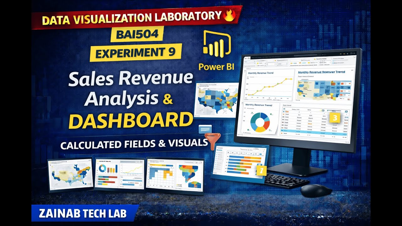
Power BI Data Visualization | Table Chart, Matrix Chart and Scatter Plot
Автор: Hecta Solution
Загружено: 2026-01-09
Просмотров: 105
Welcome to another lecture of the Power BI Full Course for Beginners.
In today’s lecture, we will learn Table Charts, Matrix Charts, and Scatter Plot Charts in Power BI. These visuals are essential for detailed data analysis, comparison, and relationship analysis in business intelligence and data analytics.
This lecture provides a step-by-step guide on how to create, format, and use these charts effectively in Power BI Desktop, with practical and real-world examples.
🔹 Topics Covered in This Lecture:
What is a Table Chart in Power BI?
When to use Table Charts
What is a Matrix Chart in Power BI?
Difference between Table and Matrix Charts
Creating Hierarchies in Matrix Visual
What is a Scatter Plot Chart?
Understanding relationships using Scatter Plot
Creating Table, Matrix & Scatter Plot Charts
Formatting and customization of visuals
Best practices for data analysis in Power BI
🎯 Who Should Watch This Video:
Power BI beginners
Data Analysts & Business Analysts
Students learning Data Analytics
Anyone interested in Power BI Reporting and Visualization
🚀 Why Learn These Charts?
Table, Matrix, and Scatter Plot charts help you:
Analyze detailed and summarized data
Compare values across categories
Identify relationships and trends
Build professional and interactive Power BI reports
📌 Beginner Friendly | Step-by-Step Explanation
📌 Hands-on Practical Examples
🔔 Subscribe for more Power BI tutorials
👍 Like | 💬 Comment | 🔁 Share with others

Доступные форматы для скачивания:
Скачать видео mp4
-
Информация по загрузке: