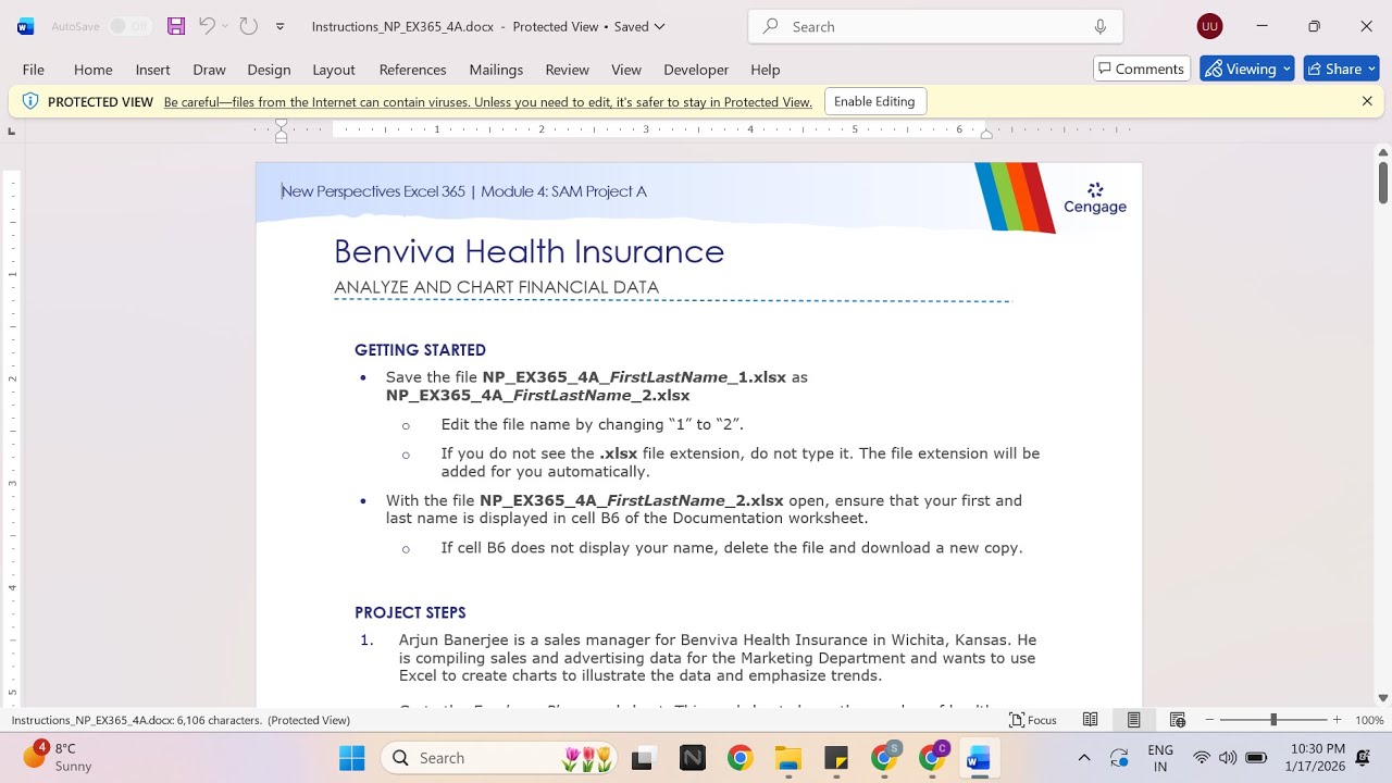
New Perspectives Excel 365 | Module 4: SAM Project A Benviva Health Insurance
Автор: Excel Tutor
Загружено: 2026-01-17
Просмотров: 0
If you directly want to get the project from us then contact us on our Whatsapp. Link is given below,
https://wa.me/message/PPXGSJS2TLWUA1
Whatsapp Contact Number:
+91 8114420233
Email ID:
excelprojectshelp@gmail.com
New Perspectives Excel 365 | Module 4: SAM Project A Benviva Health Insurance
PROJECT STEPS
Arjun Banerjee is a sales manager for Benviva Health Insurance in Wichita, Kansas. He is compiling sales and advertising data for the Marketing Department and wants to use Excel to create charts to illustrate the data and emphasize trends.
Go to the Employer Plans worksheet. This worksheet shows the number of health insurance plans sold by quarter according to plan type. Arjun wants to compare the number of plans sold in Quarter 4.
In the range F5:F9, add Conditional Formatting to show Gradient Fill Blue Data Bars.
Arjun also wants to provide a general impression of the annual trend for each plan type and for the total plans sold.
In the range G5:G10, add Line sparklines based on the data in the range C5:F10.
Format the sparklines as follows to make them more prominent:
Apply the Blue-Gray, Accent 6, Darker 50% (10th column, 6th row in the Theme Colors palette) sparkline color to the range G5:G10.
Show the High Point and Low Point data markers.
Arjun has created a pie chart representing the percentage each health plan type contributed to the total plans sold in Quarter 1. He wants to allow more room for the plot area of the chart. Modify the chart in the range I2:O17 as follows:
Change the position of the data labels to Inside End.
Move the legend to the Right of the plot area.
Arjun wants a similar pie chart showing the percentage each health plan type contributed to the total plans sold in Quarter 4. Create the chart as follows:
Create a 2-D Pie chart based on the data in the range F5:F9 and using the category labels in the range B5:B9.
Resize and reposition the chart so that the upper-left corner is located within cell I19, and the lower-right corner is located within cell O34 to show that the two pie charts are related.
Customize the pie chart you just added as follows to match the appearance of the Plans Sold: Quarter 1 pie chart:
Enter Plans Sold: Quarter 4 as the chart title.
Apply Style 4 to the chart.
Change the colors to Monochromatic Palette 6.
Change the position of the data labels to Inside End.
Change the data label content to show a Percentage rather than a value.
Move the legend to the Right of the plot area.
Arjun wants to insert a column chart that combines the quarterly sales data in a single column for each health plan type. Create the chart as follows:
Create a Stacked Column chart based on the data in the range B4:F9.
Resize and reposition the chart so that the upper-left corner is located within cell B12, and the lower-right corner is located within cell G34.
Customize the stacked column chart as follows to coordinate with the other charts and make the data easier to interpret:
Enter Plans Sold by Type as the chart title.
Change the Maximum value to 10,000 on the vertical axis.
Change the colors to Monochromatic Palette 6.
Arjun also wants a chart that compares the quarterly and total sales of the three PPO health plans. Create the chart as follows:
Create a Clustered Column – Line combination chart based on the data in the nonadjacent range B4:F7, B10:F10.
Change the chart type to show the Elite PPO plan data as a Clustered Column chart.
Move the chart to a new worksheet and use PPO Combo Chart as the sheet name.
Update the combination chart as follows to make it more meaningful:
Add a secondary axis for the Total series. [Mac Hint: Select the Total series and use the format pane to add the axis.]
Add Primary Vertical and Secondary Vertical axis titles to the chart.
Enter Plans sold per quarter as the left vertical axis title.
Enter Total plans sold as the right vertical axis title.
Enter PPO Plans Sold as the chart title.
Change the outline color of the line chart to Blue-Gray, Accent 6 (10th column, 1st row in the Theme Colors palette).
Go to the Monthly Advertising worksheet. Arjun wants to determine how closely spending on advertising is related to the number of plans sold per month. Create a chart to provide this information as follows:
Create a Scatter chart based on the data in the range C4:D16.
Change the chart title to Advertising and Plans Sold to accurately reflect the chart's contents.
Resize and reposition the chart so that the upper-left corner is loc
#samproject1a #samprojects #cengageassignments #NP_EX365_4a #NP_EXCEL #excel_assignments #excel_sam_projects #Module4SamProjecta #benviva_health_insurance #new_perspectives_excel #NP_EX365_4a_FirstLastName_1.xlsx #NP_EX365_4a_FirstLastName_2.xlsx

Доступные форматы для скачивания:
Скачать видео mp4
-
Информация по загрузке:


