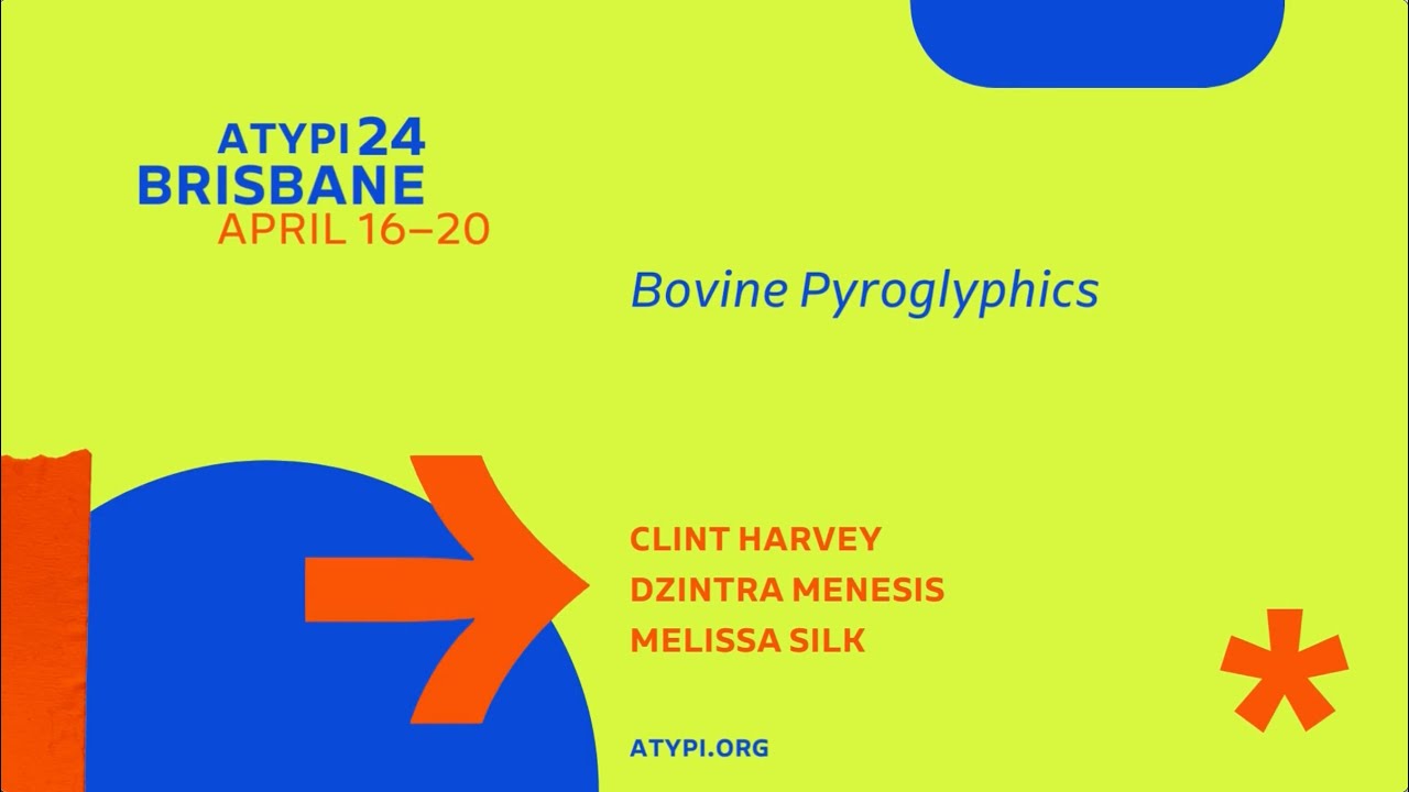
ATypI Brisbane 2024 | Clint Harvey Dzintra Menesis Melissa Silk | Bovine Pyroglyphics
Автор: ATypI
Загружено: 2024-10-18
Просмотров: 178
The 1872 Brands Act required Australian stock owners to mark their beasts with a registered brand to avoid a fifty-pound penalty. Born from a need for ownership identification, where cattle theft was an unexpected factor of colonial expansion, cattle brands challenged conventional letter shapes. Handcrafted by blacksmiths, iron letterforms conveyed legible but cryptic coded messages. Characters defy traditional typography rules with irregular tilting, connecting, or reversing, establishing a unique brand language initiated from proprietary constraints in the cattle industry. Our assumption is that the context of crafting shapes positioned at the end of an implement for marking hides necessitated the measured approach taken by John Davis of Marian Street Redfern to ensure differentiation in each letterform.
The contravention demanding legibility from a distance produces beautiful inconsistency. It is also what makes this typeface so unique. Known as Queensland Brand Designs, the typeface evokes convergence with cultural crafting, where breaking rules was consistent with the rake of early colonial Australia. Here, we present three storylines: 1) the messy history surrounding colonial ownership; 2) the unexpected whimsy in the ‘needs must’ design context where legibility and utility is king; and 3) how to craft a contemporary version of Davis’ font that restores its local significance.
This presentation contexualises the Branding Irons and Blockchains workshop by Troy Leinster and Clint Harvey. Their workshop presents Leinster’s reinterpretation of the Queensland Brand Design as the next step in developing Australian Brand typefaces, where handcrafted letterpress techniques meet digitality. We study the awkwardness of the Brands type and its unashamedly unique raison d’etre. The narrative expressed here celebrates the harmonious convergence of artistry and innovation in how we approach bovine pyroglyphics from a letterpress workshop perspective, told through a historical lens tinted with the notion of possession in the way humans exact ownership of beasts.
Доступные форматы для скачивания:
Скачать видео mp4
-
Информация по загрузке: